| Author | Thread |
Comments Made During the Challenge  |
|
|
09/04/2007 11:54:46 PM |
|
|
|
09/01/2007 03:20:33 PM |
|
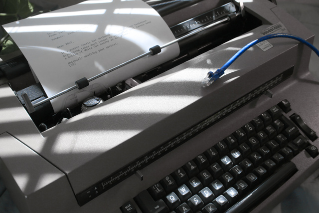
The cable is a little extra in this case, isn't it? :) |
|
|
|
09/01/2007 12:25:56 AM |
|
Creative, but not exactly what the theme wanted. |
|
|
|
08/31/2007 03:41:30 PM |
|
haha interesting interpretation. I'm sure a lot of people probably would find working without the internet very high risk! |
|
|
|
08/30/2007 03:25:30 PM |
|
LOL And the shadows from the blinds make it a much better shot. |
|
 Photographer found comment helpful. Photographer found comment helpful. |
|
|
08/30/2007 02:02:53 AM |
|
Nice capture - Like the added interest of the lighting and shadows - Could do with some saturation I think and contrast. |
|
| Photographer found comment helpful. |
|
|
08/29/2007 10:21:59 PM |
|
shadows from the blinds are a bit distracting ... |
|
| Photographer found comment helpful. |
|
|
08/29/2007 09:50:14 PM |
|
Made me laugh. Nice idea. |
|
|
|
08/29/2007 09:01:59 PM |
|
I though that exactly this approach to the topic would be a fun entry, but with a manual typewriter - then didn't enter anything. I love your choice of tone and leaving the network cable blue. Easily in my top 10 for this challenge. |
|
| Photographer found comment helpful. |
|
|
08/29/2007 03:57:13 PM |
|
I like the accent of the blue cable. |
|
| Photographer found comment helpful. |
|
|
08/29/2007 02:26:37 PM |
|
Different interpretation of the challenge, really showing a comparison of old and new technology. The shadows and light from the window are neat, but they are confusing an already very busy composition. |
|
| Photographer found comment helpful. |
|
|
08/29/2007 12:44:11 PM |
|
This is a great idea - too bad you were limited by basic editing here, as you could have cleaned the graininess up in advanced. I like the line of the blue cord. |
|
|
|
08/29/2007 12:12:58 PM |
|
|
|
08/29/2007 12:03:14 PM |
|
|
|
08/29/2007 10:34:07 AM |
|
Would have had more impact without the CAT5 cable. perhaps an addressed and stamped envelope rather than the cable, yet keeping your title would have been more effective. I like the dull colours in the shot and really like the use of light and shadows across the typewriter. 7 |
|
| Photographer found comment helpful. |
|
|
08/29/2007 07:23:34 AM |
|
Hehe cool. Was going to do something similiar with a Commodore 64. Didn't think of the typewriter! Nice. |
|
|
|
08/29/2007 02:11:06 AM |
|
Another shot with this clever interpretation. :) I like the letter, too! |
|
|
|
08/29/2007 12:31:28 AM |
|
Even worse, a "manual word processor!!" |
|
Home -
Challenges -
Community -
League -
Photos -
Cameras -
Lenses -
Learn -
Help -
Terms of Use -
Privacy -
Top ^
DPChallenge, and website content and design, Copyright © 2001-2026 Challenging Technologies, LLC.
All digital photo copyrights belong to the photographers and may not be used without permission.
Current Server Time: 06/29/2026 10:06:08 AM EDT.