| Author | Thread |
|
|
09/23/2002 08:47:00 AM |
|
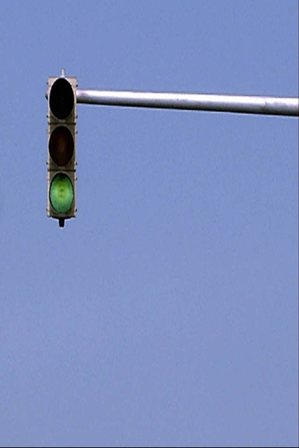
boyte, did you intentionally distort this image? It looks like it has been compresses horizontally... I haven't seen this issue in your past photos and was just wondering... |
|
Comments Made During the Challenge  |
|
|
09/22/2002 09:28:00 PM |
|
Looks a little over-sharpened to me. Might have been more "negative" if it were a red light. |
|
|
|
09/22/2002 05:55:00 PM |
It's not really boring - actually what it reminds me of is some of those old movies from the '60s or '70s where in the intro or the ending, they'd switch off whatever filter/lens they use to make the anamorphic perspective look normal and you'd get this wierd stretch kind of a thing. It gets kind of grainy looking too, so it's actually pretty cool in a very subtle way - which is really the coolest of all.
Nice job! |
|
|
|
09/21/2002 11:02:00 PM |
|
It almost looks as if you have used a digital zoom on this. If so, I may have been more beneficial to have the subject smaller, but clearer in the frame. If not, I don't know what I'm talking about, so you can ignore this! karmat |
|
|
|
09/21/2002 05:41:00 PM |
|
Color range is good. Idea is fair. More practice is needed with your image editor, as you squashed the aspect. I think your eye is good. I am looking forward to seeing more submissions from you. |
|
|
|
09/21/2002 04:44:00 AM |
|
Are the traffic lights really this shape has the picture been resized unevenly ? Apart from that I quite like it. |
|
|
|
09/20/2002 03:14:00 PM |
|
I think a red light would be more appropriate. |
|
|
|
09/20/2002 01:37:00 PM |
|
|
|
09/20/2002 01:38:00 AM |
|
image looks stretched vertically (oval lights) and oversharpened (light line under pole & splotchy blue indicates overadjusted contrast) - 3 |
|
|
|
09/20/2002 12:05:00 AM |
|
yep you got that right LOL |
|
|
|
09/18/2002 06:15:00 PM |
|
it would've been better if u hadn't stretched it out of shape. colors are too bland and the title covinces voters even more that its boring. |
|
|
|
09/18/2002 07:55:00 AM |
|
It looks like your shot has been stretched vertically which is a little strange. Also perhaps if you pushed the colour saturation up a little it might have been more engaging. 5 - floyd |
|
|
|
09/17/2002 04:54:00 PM |
|
I was going to vote high on this one until I saw the title "boring negative space" Yup, you convinced me. Be careful what you name your pictures. |
|
|
|
09/17/2002 02:15:00 AM |
Composition: 5 space 5 Lighting: good 5,
Appeal: 5, Total Rating 5 Sulamk
|
|
|
|
09/17/2002 12:09:00 AM |
|
|
|
09/16/2002 11:53:00 PM |
|
Nice idea, I wish there was clouds in this one. The green light beckons to keep on moving. It is a wierd looking stoplight too bytheway. Not enough impact for me. 4 |
|
|
|
09/16/2002 07:56:00 PM |
|
The shape of the traffic light looks rather distorted. |
|
|
|
09/16/2002 06:50:00 PM |
|
|
|
09/16/2002 05:16:00 PM |
|
the picture looks like it was stretched. the lights are oval instead of a circle |
|
|
|
09/16/2002 04:36:00 PM |
|
I take it this wasn't your best attempt? |
|
|
|
09/16/2002 04:12:00 PM |
|
Naw not boring. I like it, just needs more focus for me. Good luck. Score 6 Justine |
|
|
|
09/16/2002 04:06:00 PM |
|
Although it's not overly creative, it sure meets this difficult challenge. Good luck in the challenge. Grayce aka Gracious |
|
|
|
09/16/2002 01:57:00 PM |
|
If you know its boring, why do you waste my time submitting it? |
|
|
|
09/16/2002 01:16:00 PM |
|
Looks like you squeezed the light a bit when you resized it. Focus is just a bit soft. The color seems grainy. Meets the challenge. |
|
|
|
09/16/2002 12:56:00 PM |
|
Taking your choice of titles seriously can be beneficial :) I don't think this image is boring at all in the context of a negative space subject. i also think it's nicely composed. It appears to have suffered some distortion possibly due to resizing... :) - jmsetzler |
|
|
|
09/16/2002 12:46:00 PM |
|
The stretch ruins it, lights aint oval shaped. |
|
|
|
09/16/2002 11:39:00 AM |
|
your photo definitely meets the negative space challenge, even though i don't think you should ever use 'boring' in your title unless you want to set yourself up for bad comments. if you think it's so boring, maybe you should try and think of another example for negative space. anyway, this shot looks very much as if it has been resized to fit the challenge dimensions but the proportions have got distorted in the process (the lights are no longer round). you'll have to learn to work with your software on how to do this w/out distortion (unless of course this was deliberate and i'm just not getting it). feel free to send me a message if you'd like for me to help walk you through the steps. -- gr8photos. |
|
|
|
09/16/2002 11:07:00 AM |
|
this is cool. the only thing wrong with it is that it's stretched. mag99 |
|
|
|
09/16/2002 08:22:00 AM |
|
I don't know if it's my computer, but the image looks elongated. |
|
|
|
09/16/2002 05:30:00 AM |
|
Home -
Challenges -
Community -
League -
Photos -
Cameras -
Lenses -
Learn -
Help -
Terms of Use -
Privacy -
Top ^
DPChallenge, and website content and design, Copyright © 2001-2026 Challenging Technologies, LLC.
All digital photo copyrights belong to the photographers and may not be used without permission.
Current Server Time: 06/28/2026 10:55:39 AM EDT.