Heal brush to remove moles and beauty marks
Adjustment layer - curves - slight lighten
Brighten/Contrast
Unsharpen Mask
Gaussian Blur
Fade Gaussian blur with blend mode at soft light
resize
sharpen
save as jpeg
Statistics
Place: 296 out of 366 Avg (all users): 4.7956 Avg (commenters): 5.4545 Avg (participants): 4.8043 Avg (non-participants): 4.7895 Views since voting: 6733 Views during voting: 722 Votes: 225 Comments: 14 Favorites: 2 (view)
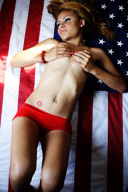
I'm not going to beat you up about the composition and angles, you've gotten enough of that, but I will mention the flag...
Use great care when using the flag (of any nation) in photos such as this. Any minor thing can be considered a slight or a display of disrespect, unless you intend to be disrespectful of a flag - such a political commentary, but I don't see that as the case here. More likely, it was a convenient backdrop.
One more thing, when the US flag is displayed dismounted (not on a flag pole), the field of stars must be on the left without regard to orientation (vertical or horizontal).
I don't like her laying on the American flag. So-called "artists" will defend it as some sort of artistic expression. I just find it disrespectful; though I will concede the possibility that if it were extremely well-done and carried some kind of deep message, there might be a possibility that it could be acceptable. Maybe. But not this one. I am not accusing the photographer of intentionally being disrespectful. I am simply expressing the view that there are some things that are inappropriate to do with the flag and that this is one of them.
I dunno... I want to like this one, but the lighting just seems so harsh. From the dark (almost in shadow) legs, to the bright tummy, to her super bright right arm (left side of image) and back to her face being so much darker than her tummy.
The question is... what is the important thing for us to look at here? Is it her stomach? Her right arm? The eye is naturally drawn to the brightest part of the image and for that reason, I think you've missed the mark on your lighting.
I also think the image would have been ever so much more powerful if her eyes connected with the viewer by looking right into the camera. But to that end, you would need to rotate her body because looking down her nose at the camera it would shut her eyes and reduce the impact. The greatest impact with eyes comes when you can see a lot of white around the eyes. That happens from a side ways glance, or an upwards glance.
The girl, however, is cute and I hope you'll show her again in future challenges.
Oh boy. These kind of shots really do nothing for me. It seems just there for the sake of attention as opposed to saying something about the model. So trying to put aside my bias, some places that could have been inproved... lighting. It seems brightest on her stomach and even blown out on her arm. I'd like to see more light and attention on her face. The pose is really unnatural. There are better ways to do implied nudity, like perhaps laying on her stomach. The lipstick print seems completely unnecessary unless this is some sort of commentary on lesbianism, in which case the person who put it there should be in the photo as well. If it's a tattoo... well then I would have cloned it out.
Gonna give you an 8 for the gratuitous nudity...had the hands been at her side, perhaps a 9 or 10 lol. Nice idea, but try again with proper lighting and I think your image will much better (I know...naturally light only on this challenge) Also, don't forget those pesky hands!!






 Add photograph to your favorites
 Add photographer to your favorites

 Photographer found comment helpful.


