Author Thread
Post actions
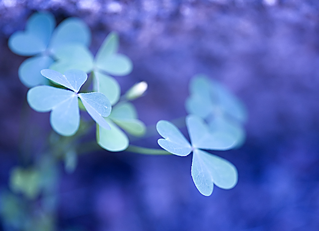
ohhhhhhhhhh, love the treatment! colors are awesome. DOF is tremendous! off to look at your other pics!
Post actions
Gee, I love this one very much, especially the blue tones, and the wonderful DOF that make this image pop..... The clarity and focus of the petals in front, is perfect.....
Post actions
I really like the DOF in this shot. The edges are razor sharp.
Post actions
I love your colors! Course i love purple and changing colors to something they werent meant to be in nature :)
Post actions
Another person saying.. Beautiful colors!!
Post actions
Ooh, nice comment from bucket! - that's nothing to sneeze at. This is really dreamy/floaty - I'm digging the colors. Almost a psychedelic feel to it.
Comments Made During the Challenge
Post actions
the blues in the background are pretty but the image really doenst grab my attention
Post actions
Dof causes a lot of issues here. I love the blue background, but because the petals are mainly oof, image lacks a primary focal point.
Post actions
nice delicate touch here with lighting, colors, processing, composition
Post actions
Post actions
Nice but not enough focus. Good potential.
Post actions
Lovely delicate capture, but a strong blue cast.
Post actions
Beautiful colors. I think your DOF was just a hair too shallow. Something about the crop doesn't sit right either, but I can't put my finger on which crop would look better.
Post actions
stunning...DOF, colour range and tones, really strong sense of composition...
Post actions
Nothing is really popping out at me because it is all the same color. I think there is too much blur and everything is the same brightness. If the BG was darker it would really make this clover pop.
Post actions
This is beautiful. I really like the different hues of blue you brought out here.
Post actions
The colours are offputting here.
Post actions
a little more DOF would increase the impact - IMHO
Post actions
really like this but i think more of the foreground leaves in focus would have made it stronger /6





 Add photograph to your favorites
 Add photographer to your favorites

 Photographer found comment helpful.


