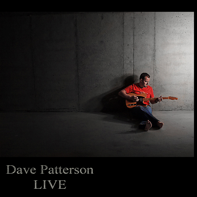
First off my models name is not Dave Patterson - its Dave Wirgler. But since the challenge is DPL album cover and not DWL album cover I made the change. Dave is our worship leader for our church plant. I had this idea on Monday and asked if him if he would be willing to pose. He was more than willing. He has this massive basement thats unfinished. It gave a great background. I used my Pedro style ringlight as the only light bouncing off the wall to the right. I used Manual settings with hopes that I would get the result I wanted. Dave gave me a bunch of different poses and I ended up with a bunch of great shots. I have several of him and his kids while they walked thorugh, sat with him for a bit and then ran off again. There were 4 kids running around the basement while shooting this.
Overall the image is a bit soft in focus, but I really think it works well for this challenge. I am hoping that it actually looks like a performers album cover that it will help it score a bit higher. First DPL entry and I hope it does well.
Post Process - RAW conversion, NI on Dave only, High Pass sharpen, full desat on the wall, cloned out a floor line, contrast mask and local contrast enhancement filters on dave only and then reduced opacity to get desired results, slight desat on his skin to reduce redness, resize, USM, minor cloning to clean up halo, big border and then text.
Statistics
Place: 11 out of 153 Avg (all users): 6.6761 Avg (commenters): 7.7647 Avg (participants): 6.2250 Avg (non-participants): 6.9474 Views since voting: 1765 Views during voting: 444 Votes: 213 Comments: 29 Favorites: 3 (view)
Compositionally, I like your use of negative space and how the guitarist and text balance each other.
Technically, I like the colors and textures in this shot. I really, really like the concrete wall. For some reason, that really gives it an edge that would be lost with a typical photography background. The lighting is what I think is the strongest, though. It is dramatic without be overly so, or too harsh. The shadow is very effective as well.
So, I'm studying it to see what I could possibly suggest to get a higher score, and *wow* -- he's barefooted. That is cool.
I honestly don't know what I could suggest for improving this. I can only suspect that the one comment below that gave you a three for not having a "band" is the mindset of the other lower votes. I dunno. It never struck me that "David Patterson - -Live" couldn't be a band. But, then, I am just weird, I guess.
You know, you could slide the text up a bit, have it overlap the border... (just kidding!) Looks good. Maybe a wee bit soft on Dave, but love the setting. (Comment only, no vote.)
Great image, very emotive, however, Dave Patterson implies a solo performer and Live is the album title, so Dave Patterson - Live doesn't cut it as a band name. I really hate to score it a 3, but feel I must.
(When can I hear the album?)
should do well, simple and effective.
although i feel the photograph is strong enough on its own with its shadows to not require the border. BUT it would change the feel of the image and would be hard to achieve the square crop.
one of the best







 Add photograph to your favorites
 Add photographer to your favorites

 Photographer found comment helpful.


