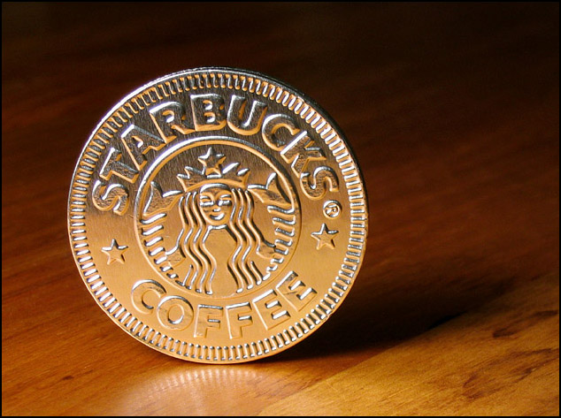
A Starbucks chocolate on my antique pine desk. Single desk lamp and shaded overhead light, custom white balanced.
Heavily increased the contrast and reduced brightess.
A little dust editing was done, and cleaned up some bright points where the join was damanged. I left a fair amount of imperfections to maintain a reasonable amount of integrity.
Statistics
Place: 72 out of 125 Avg (all users): 5.4345 Avg (commenters): 6.0000 Avg (participants): 5.2716 Avg (non-participants): 5.6406 Views since voting: 1187 Votes: 145 Comments: 11 Favorites: 0
Beautiful props, beautifully lit, beautifully staged and cropped, but the pic says 'Starbucks' and the title is 'Starbucks'. What about something like 'The shape of drinks to come' or something more stimulating?
Looks more like an ad then a "shape". :) Nice shot but doesn't fit the challenge well. If this were an "Advertisment" challenge you'd get an 8 (9 if it wasn't tilted 3 degrees to the left).
Nicely lit, good focus, simple background. Nothing wrong per se, but nothing outstanding either. Perhaps more context or meaning would help me more. What are we supposed to think about this shape? Where is this? I wish I could be more helpful.




 Add photograph to your favorites
 Add photographer to your favorites


 Photographer found comment helpful.


