| Author | Thread |
|
|
04/08/2007 08:04:51 AM |
|
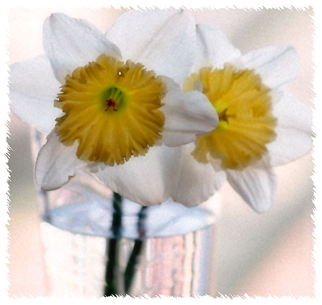
It seems like people either loved or hated it lol. No biggee. It was NOT out of focus when it was taken nor did I even sharpen it.After editing it this way it reminded me of a greeting card or something. I liked it and that's all that really matters. Thank you for all the comments. They are always helpful- well most of them lol. |
|
Comments Made During the Challenge  |
|
|
04/06/2007 08:07:24 PM |
|
 Photographer found comment helpful. Photographer found comment helpful. |
|
|
04/05/2007 08:55:06 PM |
|
Nice composition and muted colors. The glass of water really draws my attention away from the flowers, maybe because it's brighter and has more contrast with the dark stem. |
|
| Photographer found comment helpful. |
|
|
04/03/2007 12:59:16 PM |
|
I really like the filter affects on this one, very nice. |
|
| Photographer found comment helpful. |
|
|
04/03/2007 07:24:37 AM |
|
The image seems out of focus. And the border isn't doing anything for me. |
|
| Photographer found comment helpful. |
|
|
04/02/2007 10:19:09 PM |
|
| Photographer found comment helpful. |
|
|
04/02/2007 06:51:18 PM |
Right then, joke's on me as I now have to plough through 564 images and bump them all (yes, all of them) up. There'll be a third run through for fine tuning. It's day two now and I'm running late, sorry.
5 |
|
| Photographer found comment helpful. |
|
|
04/02/2007 12:35:37 PM |
|
Picture is blurry and I really don't think I like the border. The lighting in the mail flower isn't right. I think it needs to be brighter to stand out. It looks like you have maybe added some image grain and IMO image grain doesn't look good with still life shots. A couple more things, there is a white dot on the middle of the flower that is some what distracting. The other thing is, they look like they are dying. |
|
| Photographer found comment helpful. |
|
|
04/01/2007 07:34:36 PM |
|
| Photographer found comment helpful. |
|
|
04/01/2007 06:43:46 PM |
|
Pretty flowers but I think you oversharprned it to try and fix an out of focus photo. It is grainy and noisy and not appealing. Your border does not add to the photo, sorry. |
|
| Photographer found comment helpful. |
|
|
04/01/2007 05:32:52 PM |
|
I think I would have liked this image better without all the post processing. To me it took away from the natural beauty of the flowers. 6 |
|
| Photographer found comment helpful. |
|
|
04/01/2007 02:11:45 PM |
|
Borders like this seem to work well in scrapbooks. In a contest, they seem to draw attention away from the subject of the photo. |
|
| Photographer found comment helpful. |
Home -
Challenges -
Community -
League -
Photos -
Cameras -
Lenses -
Learn -
Help -
Terms of Use -
Privacy -
Top ^
DPChallenge, and website content and design, Copyright © 2001-2026 Challenging Technologies, LLC.
All digital photo copyrights belong to the photographers and may not be used without permission.
Current Server Time: 07/06/2026 03:54:51 PM EDT.