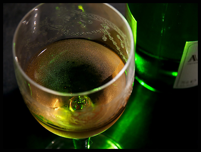
I like the angle on this, it really lets the aroma float up as if I was about to sniff and taste the wine. At first I thought that it seemed an odd composition, but it has a great feeling of familiarity and a natural look, if that makes sense. The colors are good, the lighting is atmospheric with no obviously bad reflections. I was wanting the label facing rather than being away, but I think I prefer it this way now as it doesnt become a distraction. I like it.
The composition is okish, perhaps a slightly lower angle could be better. I like the shallow dof and the capture of the bubbles. I don't like how the glass is cut off by the frame and the black/greyish background (black paper?). Try to get the background behind the glass truly black, perhaps by using a black textile or by using reflectors to light up the front without covering the background.
Colors are great and lifelike. 8





 Add photograph to your favorites
 Add photographer to your favorites


 Photographer found comment helpful.


