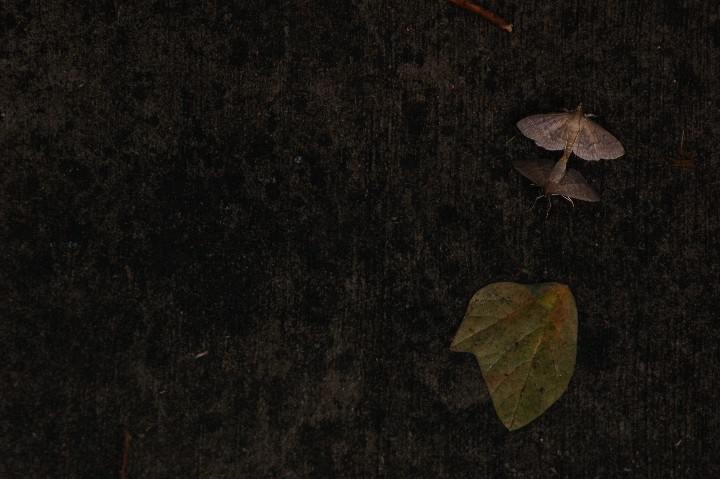
The leaf distracts from the main subject and also spoils the minimalism angle. That twig at the top could hav ebeen removed too. Slightly stronger lighting would have brought out the interesting texture on that wood more too.
I like the overall feeling and your focus is dead on. But...
I think you're just a touch too dark. The second moth is a bit too hard to see. I also think the leaf and top stick are distracting. Without the distracting elements you could have gotten a little closer on the moths to show more of their beautiful markings while still maintaining the minimalism. With something as interesting as your moths I think they could have held the photo on their own easily.
A vertical shot would work better here, IMO: want to see the butterflies and the texture of the background closer, and the dead space to the left is not adding anything to the picture. 5





 Add photograph to your favorites
 Add photographer to your favorites

 Photographer found comment helpful.


