| Author | Thread |
Comments Made During the Challenge  |
|
|
08/18/2002 12:34:00 PM |
|
|
|
08/18/2002 01:42:00 AM |
|
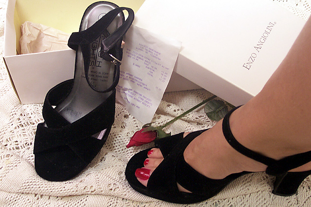
Great setup, and creative challenge interpretation. The receipt is a little overkill, in my opinion. |
|
|
|
08/17/2002 10:04:00 PM |
|
I like the Idea, the colors, I am not sure the foot brings something though ....I like the picture except the lower right quarter ... |
|
|
|
08/16/2002 05:28:00 AM |
|
|
|
08/15/2002 07:27:00 PM |
|
I like this lots... right down to the red toenails for a spot of color in the picture. This is the best of the "new shoes" pictures in the challenge. You should sell it for advertizing. |
|
|
|
08/15/2002 01:10:00 PM |
|
Good composition. I think the rose is a nice touch. Gives the feeling that she is ready to go out for the evening. I like the use of the receipt, but think it looks a bit too placed. (9) |
|
|
|
08/15/2002 11:50:00 AM |
|
Here I go being extremely picky again. At first glance, this photo is really nice. I like the subject, the way it's set up with the lace and the rose, and I even like the shoes. The recipt (although depicting "new") doesn't really fit with the sexy "I have new shoes and I have a hot date tonight" look of the photo. I think just having them by the box would be enough to depict that they were new, and still keep the original look you were going for. Maybe it's just my lack of knowledge on dress shoes, but the name brand on the box doesn't seem to match the name brand on the shoe. I realize that the name on the box could be the designer, and the name on the shoe could be the company, but unless you have the knowledge of that particular brand, you may not know that. Another thing that catches my eye is the toe nail polish on the big toe. It either has strange reflection, or it's not been put on in a smoothe coat. I also notice a few small white speckles on the shoes that look kind of like lint. Sorry I'm being so picky, sounds like I'm tearing it apart, but I gave it a high rating and I like it very much. The message being portrayed is very "new". The new rose, new shoes, and possible a new date. Great job with this. The lighting is excelent. Good luck! |
|
|
|
08/14/2002 11:28:00 AM |
|
|
|
08/14/2002 10:11:00 AM |
Wicked photo; one I'm sure the ladies will identify with :) This is a class shot, it's technically unfaultable – but I expect the purists will find something – and the bill and the rose really set it off. It's not cluttered, it's central theme leaps out and it meets the challenge with aplomb.
EASY 10… Winner? May be... Best of luck...
|
|
|
|
08/13/2002 07:20:00 PM |
|
lack of detail in the black. Shoes and fake rosebud seem a bit trite to me...but I'm not a big shoe person. Perhaps the right viewer will appreciate your effort the composition is very nice |
|
|
|
08/13/2002 07:08:00 PM |
|
Among other things, she has a really bad pedicure. |
|
|
|
08/13/2002 05:28:00 PM |
Something new.
Composition - Very good. Rose & painted nails sets this apart.
Technical Aspects - very good. Perhaps a little bright on top of box, but so what.
Meets Challenge - yes
Visual Impact / Originality – high
Top 5
Jim msp
|
|
|
|
08/13/2002 01:26:00 PM |
|
good choice of red accents. |
|
|
|
08/13/2002 12:29:00 PM |
|
interesting composition :) - I think the receipt could have been excluded here... the rose is a nice touch though :) - jmsetzler |
|
|
|
08/13/2002 12:50:00 AM |
|
I really like this shot! Good contrast in colors. Well composed. |
|
|
|
08/12/2002 10:00:00 PM |
|
Nice concept. good shot. 7 kdjohnson |
|
|
|
08/12/2002 09:41:00 PM |
|
the rose feels a bit too contrived in this shot |
|
|
|
08/12/2002 09:22:00 PM |
Composition8
Technical Aspects7
Appeal6
Creativity7
Rating7Autool
|
|
|
|
08/12/2002 08:05:00 PM |
|
Cute idea...I was trying to zoom in to see how much you paid for them.... :-) |
|
|
|
08/12/2002 07:00:00 PM |
|
nice idea ! I like the look and feel of the picture |
|
|
|
08/12/2002 06:27:00 PM |
|
|
|
08/12/2002 05:59:00 PM |
|
It looks like you worked hard to make this image project class - to that effect, i would have left the receipt out of the picture |
|
|
|
08/12/2002 11:51:00 AM |
|
I would have liked this better without the receipt. I think the receipt takes away from the class of the photo. 7 |
|
|
|
08/12/2002 11:13:00 AM |
|
This shows an effort on the part of the photographer NOT to be 'cliche'. I like it. |
|
|
|
08/12/2002 03:30:00 AM |
|
Home -
Challenges -
Community -
League -
Photos -
Cameras -
Lenses -
Learn -
Help -
Terms of Use -
Privacy -
Top ^
DPChallenge, and website content and design, Copyright © 2001-2026 Challenging Technologies, LLC.
All digital photo copyrights belong to the photographers and may not be used without permission.
Current Server Time: 07/17/2026 03:19:48 AM EDT.