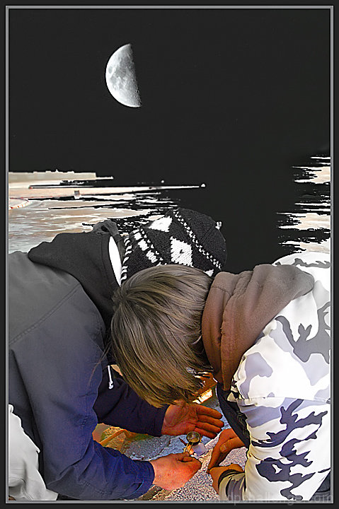
The thing that I find distracting in this image is the large negative space in the upper right quadrant of the picture caused by the straight line of the half moon leading directly down to the left bank of the fjord. And I am confused by the abstract black and white of the fjord vs the very realistic foreground with the boys/men.
The odd thing is that those same things are what I like about the image. I just think I would like them in separate shots. The abstract of the fjord and moon would be good as one, and the boys/men would be good in another. Or the boys and moon without the fjord.
I have no problem with the quality of the image on my monitor. Larus probably has a much finer setup than I do.
Thanks for all the comments.
3 pictures, one of the men, one of the fjord and one of the moon in the night sky.
I should have left the moon out, maybe - got a bit conceptually carried away.
Another thing that I might have done is explained in the title that these are two heroin addicts cooking up a fix.
Then again, dpc is a family programme, so maybe I just shouldn't show things like that at all.
I chose the shot with the faces hidden in case their mothers see it.
The black sky is toned down by choice to fit in with the fjord, but all of that's pretty disastrously done, so . . .
I'm sorry to say that the contents of this picture are, indeed, real.
The frozen fjord and the people are taken within twenty yards and ten minutes of each other.
I hang my head.
Well three things bother me with this shot and made me vote a 3. The first and smallest thing is that there is no face in this shot to make me identify with anyone. Then I dislike the image quality, fisrt the color noise, most visible in the hands and then the selective desaturation, most visibleon the brown cap and blue jacket towards the tops.
Thirdly and this is the big thing, that backround just really looks fake and unreal and just doesn´t do it for me, sorry :(
No Giant Steps...and...over-kill. It looks like you had fun making it though. I'm sure you'll smoke my photo. Thanks for at least taking advantage of the rules.
I find the black area above the kids heads very distracting. It does not draw the top and bottom of the image together, but rather forces it into two distinct areas.





 Add photograph to your favorites
 Add photographer to your favorites

 Photographer found comment helpful.


