| Author | Thread |
Comments Made During the Challenge  |
|
|
08/18/2002 12:15:00 PM |
|
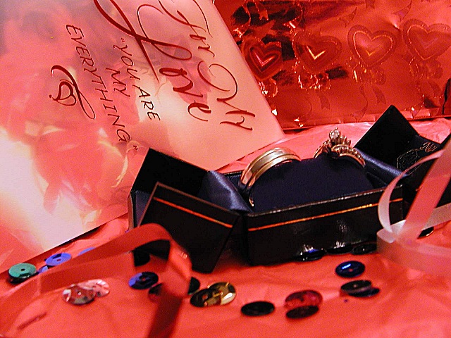
Very nice! I like the setup you have created here. The righs are beautiful and the other props you have displayed are also adding a nice sense of excitement to this photo. Good shot :) - jmsetzler |
|
 Photographer found comment helpful. Photographer found comment helpful. |
|
|
08/18/2002 02:45:00 AM |
|
| Photographer found comment helpful. |
|
|
08/17/2002 03:33:00 PM |
You thought out and arranged this shot beautifully.
The only distraction is the reflection off the book. A possible enhancement (if you were to sell this picture) would be a reflecting beam from the gem in the ring. |
|
| Photographer found comment helpful. |
|
|
08/16/2002 11:49:00 PM |
|
I love all the red but the black box detracts from the red theme. I may have scored this better if the rings had been laying together out of the box. I think the blur effect in the foreground would be more complimentary without the sequins.... |
|
| Photographer found comment helpful. |
|
|
08/16/2002 04:16:00 PM |
|
concept of rings is good, but too much red distracts from the rings... I lose focus on the rings. Also I find the foreground looks blurry... again distracting. I would crop in close on those rings, get great detail there, and let the picture tell the story rather than the title. |
|
| Photographer found comment helpful. |
|
|
08/16/2002 10:41:00 AM |
|
I don't get all the sequints....how do they fit in? Rings could be better focused. This has lots of potential...good subject. Needs work. |
|
| Photographer found comment helpful. |
|
|
08/15/2002 07:41:00 PM |
This one is kinda scary.....O.K. newly married couple challenge? Suggestion: try to limit yourself to hopes or dreams (a small joke), seriously, I think there are tooo many items in this shot. Keep the rings (but display them so we can see more of the ladies ring, it disappears at the edge of the box); select one more item, let's say the card, throw out the rest as too busy (O.K. leave the ribbon, too....)
7 Swash |
|
| Photographer found comment helpful. |
|
|
08/15/2002 02:41:00 PM |
|
This is pleasing to look at. Looks like an ad that would be in a magazine. However, the card seems to be in better focus than the rings. Still a really great photo. Great job and good luck in the challenge. |
|
| Photographer found comment helpful. |
|
|
08/15/2002 11:34:00 AM |
|
I really like the colours in the picture; they give a warm romantic glow. While the composition seems a little busy, the overall shot is good, but I can't help feeling that the challenge target hasn't be hit too well. Exposure and technical merit are very good… Not the best judgement, sorry to be negative… |
|
| Photographer found comment helpful. |
|
|
08/14/2002 03:51:00 PM |
|
Of course, "Weddings" aren't very creative, but I really like the colors, and the lighting. This is creative. 8 |
|
| Photographer found comment helpful. |
|
|
08/13/2002 10:14:00 PM |
|
Reminds me of the picture of the Fear challenge "Fear of Commitment"; but that might just be a coincidence. It looks nicely decorated, but I don't think the colors mix very well. The rings are not very clearly visible... |
|
| Photographer found comment helpful. |
|
|
08/13/2002 10:04:00 PM |
Something new.
Composition - pretty good. The rings could be shown better, in my opinion
Technical Aspects - pretty good.
Meets Challenge - yes
Visual Impact / Originality – pretty good
Jim msp
|
|
| Photographer found comment helpful. |
|
|
08/13/2002 05:51:00 PM |
Interesting jumble, kind of representative of newly married life perhaps. Toooooo red.
5, Kavey |
|
| Photographer found comment helpful. |
|
|
08/13/2002 03:13:00 PM |
|
You could sell this one as a valentine card! :) |
|
| Photographer found comment helpful. |
|
|
08/12/2002 10:02:00 PM |
|
I like the concept and the set up....I just wish it were a little more focused on the rings. |
|
| Photographer found comment helpful. |
|
|
08/12/2002 09:44:00 PM |
|
very busy. I prefer these sorts of things to be 'cleaner' Busy would be okay if it was a lot of the same thing, but there seems to be too many different elements |
|
| Photographer found comment helpful. |
|
|
08/12/2002 09:33:00 PM |
Composition7
Technical Aspects6
Appeal7
Creativity7
Rating7Autool
|
|
| Photographer found comment helpful. |
|
|
08/12/2002 08:08:00 PM |
|
Nice composition and DOF. Very well put together, it makes me want to go get married. |
|
| Photographer found comment helpful. |
|
|
08/12/2002 06:21:00 PM |
|
ah to be starting out again, nice thought |
|
| Photographer found comment helpful. |
|
|
08/12/2002 04:49:00 PM |
|
the card seems to be more in focus than the rings. maybe that was your intent but i think maybe the rings should be the focal point especially in this compositon |
|
| Photographer found comment helpful. |
|
|
08/12/2002 01:45:00 AM |
|
I love this one ! So romantic...and love a NEW Shiiizzzam |
|
| Photographer found comment helpful. |
Home -
Challenges -
Community -
League -
Photos -
Cameras -
Lenses -
Learn -
Help -
Terms of Use -
Privacy -
Top ^
DPChallenge, and website content and design, Copyright © 2001-2026 Challenging Technologies, LLC.
All digital photo copyrights belong to the photographers and may not be used without permission.
Current Server Time: 06/28/2026 11:26:21 AM EDT.