| Author | Thread |
Comments Made During the Challenge  |
|
|
08/18/2002 08:27:00 PM |
|
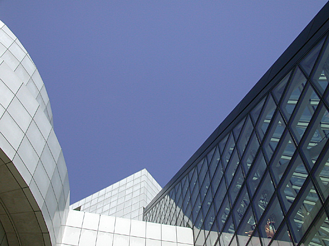
There's nothing in the photo leading me to believe this building is new....Maybe it's an old building. |
|
|
|
08/18/2002 01:52:00 AM |
|
This is a very nice angle. I like how there are curved lines and straight lines and how you can see through the windows. The extreme whiteness of the building definately makes it look new and I love the color of the sky. I even like the fact that there are no clouds in it. The title could use a little work, but this isn't the "best title challenge" and it gets it's point across, so New Building, it is. Nice shot and good luck in the challenge. |
|
|
|
08/16/2002 10:39:00 AM |
|
Nice strong angles, good color. |
|
|
|
08/15/2002 09:14:00 PM |
|
|
|
08/15/2002 12:31:00 PM |
|
Ok, I am certainly no expert, but I just love this photo...The building frames the sky beautifully! Very nice pic :) |
|
|
|
08/15/2002 06:41:00 AM |
|
More "new sky" than "new building" :-) The arrangement jars a little since there's no natural place for your eye to sit. Interesting shapes though. |
|
|
|
08/13/2002 11:59:00 PM |
|
Interesting, effective composition. No one should question that it's a new building. |
|
|
|
08/13/2002 09:19:00 PM |
Composition7
Technical Aspects6
Appeal4
Creativity5
Rating6Autool
|
|
|
|
08/13/2002 06:08:00 PM |
Something new.
Composition - quite good, one minor distraction in reflection at lower right
Technical Aspects - very good. Great sky
Meets Challenge - yes
Visual Impact / Originality – quite good
Jim msp
|
|
|
|
08/13/2002 03:11:00 PM |
|
Really like the color of the sky against the buildings. Nice. |
|
|
|
08/13/2002 01:49:00 PM |
|
A little too much sky in the picture. Great angles, though. |
|
|
|
08/12/2002 08:04:00 PM |
|
interesting but the main focal point to me seems to be a big blue sky...perhaps from another angle? |
|
|
|
08/12/2002 07:32:00 PM |
|
|
|
08/12/2002 06:39:00 PM |
|
Is that the Rock & Roll Hall of Fame? I've photographed that spot before -- what a cool design! I like this composition. |
|
|
|
08/12/2002 05:46:00 PM |
|
Nice composition. I love the variety of lines: descending, ascending and rounded. I give it a 8. |
|
|
|
08/12/2002 05:28:00 PM |
Lovely. Toooo much sky for me though.
5, Kavey |
|
|
|
08/12/2002 04:42:00 PM |
|
Nice composition and form. 7 md |
|
|
|
08/12/2002 03:11:00 PM |
|
Abstracts are always nice. Good contrast and positioning. |
|
|
|
08/12/2002 12:25:00 PM |
|
Nice picture, but too much sky. |
|
|
|
08/12/2002 12:12:00 PM |
|
|
|
08/12/2002 03:44:00 AM |
|
looks nice, but if you increased the contrast a little, it would look better in my opinion. |
|
|
|
08/12/2002 03:28:00 AM |
|
I like the different diagonals you have going in this picture, |
|
Home -
Challenges -
Community -
League -
Photos -
Cameras -
Lenses -
Learn -
Help -
Terms of Use -
Privacy -
Top ^
DPChallenge, and website content and design, Copyright © 2001-2026 Challenging Technologies, LLC.
All digital photo copyrights belong to the photographers and may not be used without permission.
Current Server Time: 06/27/2026 01:45:53 PM EDT.