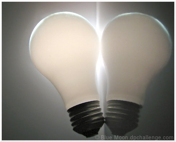
I know thw background looks dark, but it IS actually white. It just turned dark when I turned off the lights, I wonder why :p
Took this 2 hours before the deadline and submitted less than an hour before. All in all this turned out above my expectations--except for the background not being perfectly white. Grr, so frustrating, but I had to turn of the lights to show the light bulb, but couldn't turn up the exposure too much or the edges would be blown out. I chose the lesser of two evils, but I'm sure I'll get dinged for it anyway :(
So...the setup consisted of 2 pieces of high gloss photo paper, an unplugged lightbulb, a flashlight, and some tape. I put one piece of paper flat onto the table glossy side up, and another standing up behind it. I taped the vertical piece of paper to a flashlight laying behind the paper. I kept the paper stright with a perfume and mousse bottles...pretty high tech, don't ya think? Then I turned on the flashlight which made a circle of light the same cicumference of the bulb. I place the bulb onto the paper, put my camera on the table, even with the bulb, tuned off the overhead light, and shot this. The hardest part was getting it in focus...I was only about 8 inces away and had it set to macro, but it just DID NOT want to focus. I tried to focus on the edge of the bulb, but I think it went more for the threading :(
In editing I rotated it, cropped it, blurred the background, added digital flash and just a touch of color and contrast. It came out alright, but the background could've been better, sigh.
Statistics
Place: 212 out of 233 Avg (all users): 4.6486 Avg (commenters): 4.2500 Avg (participants): 4.5517 Avg (non-participants): 4.7347 Views since voting: 1074 Views during voting: 280 Votes: 185 Comments: 5 Favorites: 0
Interesting that both the new Suck members chose to use a disconcerting rotation - means you've joined the right team! I love your explanation - I, too, use high tech stuff like you do. Chairs, drapes, hangers, bottles - all can be used in very creative ways to hold props, lights... those fools with full light sets don't know what they're missing.
Anyway, on my laptop monitor, which shows very great detail at the high end, I can see a lot of noise in the threads, both actual and reflected, which means something with respect to processing, I'm sure... too light, maybe?