To the 4 people who gave me a 1, (explitive deleted by me since you are not even worth that.)
To everyone who had opinions about the color or lack of color, how the image was framed, or the model's pose god bless you and when you shoot this shot go ahead and then thank me for your inspiration, otherwise look at this image as my personal creativity not yours.
To everyone who liked it but it was a little off from what you thought and you expressed it in a constructive way thank you but that is just what I wanted in this image.
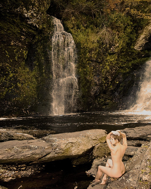
I wanted it to highlight Renee sitting at the edge of the pond. Not to highlight the waterfall either the soft waterfall in front of her or the giant ones to the right. I wanted the picture about the model not the waterfalls they were just something in the image to give it interest. Your eye wants to go to the falls but is grabbed and brought back to Renee’s back and it’s like you can’t turn away. Between the onsite flash off to the left out of the frame or the darkness of the cliffs you can’t help but stare at Renee as if you were in the woods behind her hiding to watch.
Nothing in this image is an accident.
Everyone knows some of my images are a little off, or a little different or maybe even completely misunderstood by the masses. Good that’s my ignorant side just being creative in my work. By Ignorant I mean, I am happy not to know the key to scoring a 9 every time on DPC, I am glad I don’t copy others in my work but try to just see what pleases my eye and recapture it in a way to share with others.
Some like it, thus the 5 tens, some hate it ergo the four 1’s. Most if you look carefully had pretty good reaction to my image. Only 41 people scored it below average out of 182 votes. I am happy with the results and again want to thank Stan and Renee for helping me put this shot together.
Great location and photo! Just not sure of the lighting or exposure and the colour saturation. If you open this in photoshop and do an auto levels, this gets heaps more punch. Manual adjustment can do more.
A little increase in the saturation will aloo bring out the luscious greens a bit more. 6
This photo has almost a 60's or 70's kinda look to it. Lovely model and a beautiful scene. I'm not sure that the desaturation works for me, as I'd like to see the color in that beautiful scenery.
JMO, either the girl or the camera is in the wrong place. The dark abyss at her feet doesn't help. Move her up to the rocks bordering the upper pool and crop out the lower section. Also, level the upper pool shoreline at the base of the falls (rotate the image slightly clockwise). Some minor adjustments would make this a winner!
An image with a lovely girl and waterfall. I would have positioned the left leg just a little out to the left so as to avoid ambiguity of tones by the shin. Still, very impressive. 7
good shot, i find my eye drawn to the green area to the left of the central water fall, not sure if its the colour or the texture of the plants on the rocks. Would have maybe had the white water looking more white but that may not be possible due to the waters content. Beautiful model and pose though there may be some overly light areas compared to the rest though e.g. her right knee.
I don't think the colors in this shot really do it justice. They are kind of flat and muted. Also, I think a different crop would help to make the composition stronger. If the model were further up in the frame, it was cropped closer on the left, and more of the right falls were showing, you would have a nice triangle for the eyes to go "around" when viewing.






 Add photograph to your favorites
 Add photographer to your favorites


 Photographer found comment helpful.


