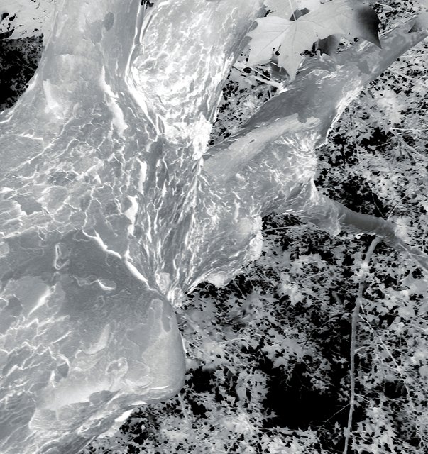
It was color, but looked better in black and white, so I changed it. I'll put that b&w one in my portfolio so y'all can see what it looked like before I used the "negative" effect on it.
Statistics
Place: 244 out of 251 Avg (all users): 4.0846 Avg (commenters): 4.0667 Avg (participants): 3.8842 Avg (non-participants): 4.2642 Views since voting: 780 Views during voting: 312 Votes: 201 Comments: 17 Favorites: 0
slightly disorientated as it took me a moment to realise it's taken looking up, not down. using the negative trick made the dizziness moreso. i actually quite like the abstract nature of this, and strikes me as something quite creative. the only thing that lessens the abtract feel is that pesky leaf up the top, which looks far too conventional and normal. but i love how the rest of the leaves form a nicely random patterned background to the trunk. visually quite lovely.
new scoring system™; composition + technical 2/3, challenge 1/1, post processing results 1.5/2, ooooh factor 2.5/3, originality 1/1 = 8
Initially I really don't like it, but it's very interesting and captivating the more you look at it. I like the bark, especially the whites. The main that's confusing to my eye is the composition. It's definetly abstract, but for me it's not pleasing. For me there's a balance between pros/cons,so a 5.
I am not sure why you made this a negative photo. It's not that bad in its original form although the sky is overexposed. The negative image doesn't appeal to me.
Ick - funny how reversing an image makes it so unappealing to the human brain (or maybe just my brain that likes things the-way-they-are-supposed-to-be).
I like the inversion but the composition doesn't help me enjoy the subject....too much tree trunk, too little of the leaves which are the most interesting part of the image.





 Add photograph to your favorites
 Add photographer to your favorites


 Photographer found comment helpful.


