DPChallenge: A Digital Photography Contest You are not logged in. (log in or register
 
Challenge Entries
Portfolio Images
This image is not part of a public portfolio.
Sweet Tart Spill
Sweet Tart Spill
Kaveran


Photograph Information Photographer's Comments
Challenge: Pastels (Advanced Editing IV)
Camera: Canon EOS-30D
Lens: Canon EF-S 18-55mm f/3.5-5.6 USM II
Location: light tent at home
Date: Sep 3, 2006
Aperture: f/25
ISO: 100
Shutter: .5 sec
Galleries: Still Life, Food and Drink
Date Uploaded: Sep 3, 2006

Playing with my light tent. Shot in Raw, very little PP done. Custom white balance via camera. Levels and crop. Focal length 44mm.

Statistics
Place: 132 out of 203
Avg (all users): 5.2634
Avg (commenters): 5.7000
Avg (participants): 4.8961
Avg (non-participants): 5.5229
Views since voting: 1060
Views during voting: 266
Votes: 186
Comments: 12
Favorites: 1 (view)


Please log in or register to add your comments!

AuthorThread
09/16/2006 02:36:40 PM
Critique Club Review:

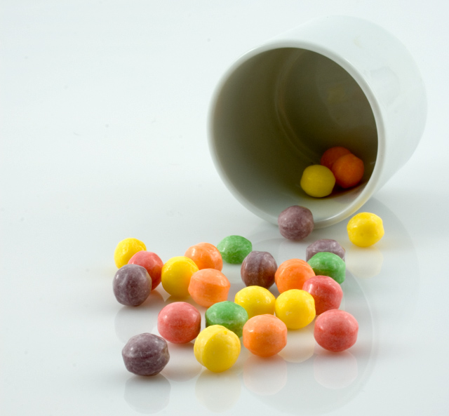
Lighting, color, saturation, hue, exposure, contrast, and brightness are all well done.

Focus is very good. Depth of field is good.

The drawbacks here are, the cup tends to become indistinct against the background, especially on the upper left. And, the one that cost you votes, no pastels. Although you made the colors light and bright, they are still not pastels.

Most voters vote quality of picture, and how the picture meets the challenge. Some people rail against having a good picture voted lower because it just didn't fit the challenge. Unfortunately, this is not the way the voters tend to think. And personally, I agree. The idea of a challenge, is to be challenged by the subject. Otherwise we would have anarchy and week after week of free studies.

This is a good picture, and unfortunately it suffered from being in the wrong challenge.
  Photographer found comment helpful.
 Comments Made During the Challenge
09/10/2006 03:48:37 AM
I love the way you did your lighting.
09/09/2006 08:32:16 PM
these are not pastel colors--pastels are soft pinks, blues, greens and yellows--these are primary colors.
09/08/2006 03:35:18 AM
Those look like primary colors to me and not pastels. Sorry to be brutally honest.
09/07/2006 06:05:42 PM
Those colours look a bit too bright to be considered pastels. Set up is good, focus seems a bit soft.
09/04/2006 08:15:19 PM
The shadows appear to be a touch noisy. I love the colors, clarity, highlights and reflection on the surface.
  Photographer found comment helpful.
09/04/2006 01:41:40 PM
Very staged. Not pastel.
09/04/2006 09:17:47 AM
This would have rated higher with me without the cup. Your eye pulls to the darkened center. But great concept!
09/04/2006 04:53:29 AM
nice image
09/04/2006 02:50:00 AM
Love the simplicity
09/04/2006 02:08:17 AM
It's pretty, but not what I'd call pastel. More along the line of primary colors.
09/04/2006 01:29:31 AM
ilike the choice of subject here


Home - Challenges - Community - League - Photos - Cameras - Lenses - Learn - Prints! - Help - Terms of Use - Privacy - Top ^
DPChallenge, and website content and design, Copyright © 2001-2024 Challenging Technologies, LLC.
All digital photo copyrights belong to the photographers and may not be used without permission.
Current Server Time: 04/23/2024 11:57:17 AM EDT.