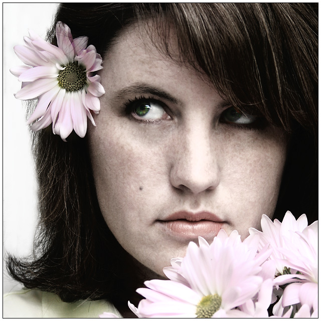
So I bought these flowers for my now ill-fated silhouette entry and I thought to myself, hey they're pastely (I love making up words!) :-)
So here is a rush job. Please excuse the overly cloned flyaway hairs at the bottom. I went a little overboard and just don't have the time to go back and fix it now.
I don't know how this will do and don't really care (although I do hope it helps out The F/Stops at least) as it was just a last minute, fun little idea that may or may not translate well to the challenge.
Statistics
Place: 42 out of 203 Avg (all users): 6.0162 Avg (commenters): 7.4118 Avg (participants): 5.7391 Avg (non-participants): 6.1810 Views since voting: 918 Views during voting: 296 Votes: 185 Comments: 20 Favorites: 0
Certainly not what I expected and in my opinion not fairly treated. Nonetheless you've got a great image to add to your portfolio and one to be cherished... :)
I think this is my favorite portrait in the entire challenge...love the processing, particularly the pink of the blooms...and that hint of green in the iris of the eye is just perfect...very nice.
I like the composition of this portrait alot. I like the flowers in the corner foreground and the flower tucked behind her ear in the upper corner, with her face in between. Very nice way to keep the viewer's eye on your subject. I like the muted colors for this challenge. Nice even lighting. The highlights on the top of her nose seem blown and lack detail. I wish there was a catchlight in her shadowed eye. Even in shadows, it helps to have a little catchlight there so the eye doesn't completely go 'dead'. 7 from me.
I saw this in thumbnail and it didnt grab me. But coming across it in voting and seeing large makes a good difference. I like the overall pink tones but it is the eyes that pull it all together. Very nice. 7 for now.
I don't know what you did to her skin but it looks very mottled and unhealthy and there are areas in her nose, to the sides of her nostrils that are blown out. It could have been quite a nice portrait but you have to be very careful on the skin tones and textures. In this case, it ruins the shot.
Nicely composed. I expect your photo would look nice in sepia tones as well. A flower in the hair is a symbol of carefree happiness, is it not? I wonder if the eye-line should be a touch more horizontal. Probably has no effect whatsoever...
Ok, so let me start by saying that you get a 10 and in my opinion deserve the blue ribbon without a close second. Instead of taking a pastel color and making it your background to meet the challenge, you chose a colour that compliments your look and editing choices perfetcly. My eye dances from eye to flower to face and back again and the green of your eye seems glued to the green core of the flower while the soft colour of your face ties to the yellows and pinks remarkably well. Even the choice to look up as if you're prompting the viewer to get involved is perfectly fitting. Congratulations on taking the theme and incorporating it into a truly remarkable piece of work which I feel is one of the best casual portraits I've seen in a long, long time... I am so impressed. 10
actually, I do like you, but I also love this image...really suits the challenge, beautiful lighting and soft colour really suit the challenge...and those eyes...





 Add photograph to your favorites
 Add photographer to your favorites

 Photographer found comment helpful.


