| Author | Thread |
Comments Made During the Challenge  |
|
|
09/07/2006 10:37:34 PM |
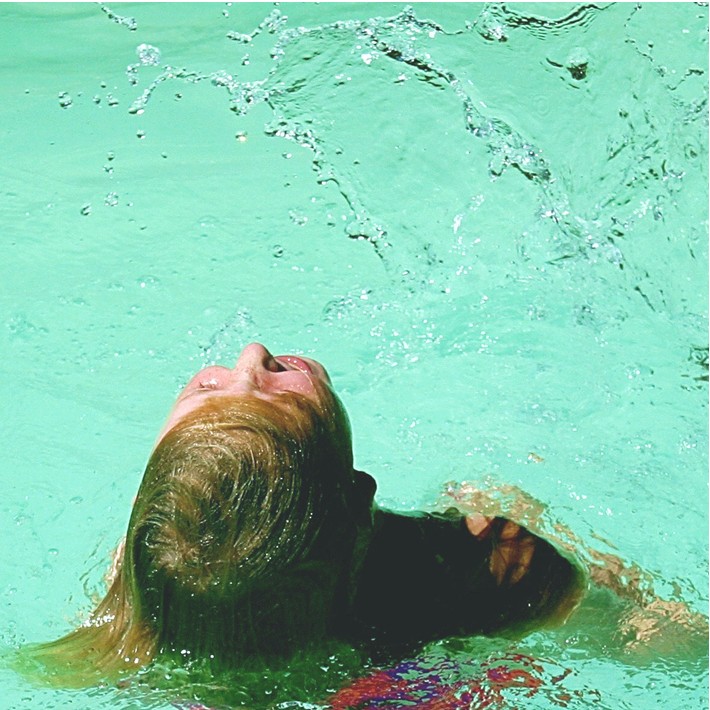
I have long wanted to try the hair-swirling, water-trailing shot, but never have been able to, as I know it is difficult, and so appreciate your attempt here.
In your shot, the water (pool) color is not really appealing and very high on contrast, making the water being thrown, very difficult to distinguish from the background. The colors overall seem a bit off also, as her hair literally looks green in some areas, mostly due to the pool color. The human element could also be better represented by having a face to add to the composition, or having her hair nearly obscuring her, as it flies around.
Take a look at skiprow's  shot to see what I am referring to. shot to see what I am referring to. |
|
|
|
09/07/2006 01:20:02 PM |
|
Nice stop action, but it took too long for my eyes to find the splash for the image to work well. The slightly blurry swimmer grabs the eye and it takes a few beats to see the splash, which is the true subject of this image. I think a looser crop would improve that. Also making it more landscape and less square would help. |
|
|
|
09/06/2006 11:28:47 AM |
|
another great kid in the water shot (the best one in this free study). Good whirl of color and light, good sense of immersion, of letting go. 9 |
|
|
|
09/04/2006 11:02:08 PM |
Technical: the composition is great, love the coloring, great lighting too!!!
Creativity: i wish you could see the flinging water a little better
Score: 8 |
|
|
|
09/04/2006 03:59:58 PM |
|
|
|
09/04/2006 01:32:50 PM |
|
|
|
09/04/2006 02:28:43 AM |
|
the most wow thing about this picture is the stunning colour of the water, and then it's the action that hits you. i love how obscurely alive this picture feels... the slightly washed out colours also suggest a particular period of time (sixties / seventies) and this in turn gives it extra character. my only slight wish was the the purple red swimsuit wasn't so purple and red; but aside from that this is a really captivating, enjoyable and intense image. 9. |
|
|
|
09/03/2006 02:37:00 AM |
|
The water at top is wonderful - good detail, color, and the added benefit of being interesting to look at. The lower part lets you down however, in my opinion - please realize that I'm a total amatuer. I think the girl's head is where the eye is drawn to, not to the water. And unfortunately, it looks like the image quality is suffering a bit there. It seems out of focus or something. The area to the right of her head is also distracting, as it is difficult to identify and looks sort of blobby. But the idea is fantastic as is the water at the top. |
|
|
|
09/02/2006 09:42:10 PM |
|
nice stopped motion the colors seem off to me though. hth. |
|
|
|
09/02/2006 08:29:23 AM |
|
Like your action but there seems to be a green tint. |
|
|
|
09/01/2006 06:26:33 PM |
|
Nice composition, but I think you want to check your monitor calibration as the colors seem very off on my screen. |
|
|
|
09/01/2006 02:44:54 PM |
|
a bit too green over all and could use more contrast. |
|
|
|
09/01/2006 03:44:24 AM |
|
Home -
Challenges -
Community -
League -
Photos -
Cameras -
Lenses -
Learn -
Help -
Terms of Use -
Privacy -
Top ^
DPChallenge, and website content and design, Copyright © 2001-2026 Challenging Technologies, LLC.
All digital photo copyrights belong to the photographers and may not be used without permission.
Current Server Time: 06/28/2026 09:12:05 AM EDT.