| Author | Thread |
|
|
07/29/2002 11:26:00 PM |
|
I guess I?m just not very photogenic huh. Dinner was fun though wasn't it? Maybe you should have submitted the shot of the ceiling in the pizza joint instead. - Happy Trails, -Mike |
|
Comments Made During the Challenge  |
|
|
07/28/2002 09:35:00 AM |
|
On my monitor it's just too dark to really decipher |
|
|
|
07/27/2002 12:08:00 AM |
|
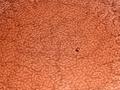
A crop that exclude everything but the shirt would have helped this alot for me. Great texture on the shirt, but the right side keeps pulling my attention away. |
|
|
|
07/26/2002 05:12:00 PM |
|
I can't tell you what this is. |
|
|
|
07/26/2002 01:15:00 PM |
|
I think the image fills up the screen too much and is too dark to really make out what you're trying to do. |
|
|
|
07/25/2002 06:32:00 PM |
|
Unfortunately, the couch/chair is more identifiable as texture to me than the shirt. It almost looks oversharpened to me. Maybe a little more light would have defined it better. karmat |
|
|
|
07/25/2002 02:32:00 PM |
|
I do see the texture. However this shot doesn't demonstrate many other skills or techniques that I would use as criteria for a good shot. The only thing it does is show an example of texture. It seems blurry. It doesn't capture my interest. |
|
|
|
07/25/2002 05:07:00 AM |
|
|
|
07/24/2002 05:16:00 PM |
|
This photo is to dark, and lacks any interest. Perhaps more lighting, a different color shirt or making the photo B&W.Also you should have cropped the right side. |
|
|
|
07/24/2002 04:49:00 PM |
Composition7
Originality9
Technical Aspects9
Meets Challenge6
Total Score8
For those that are just learning, like me.
Composition: Scoring in this area is based on basic composition of a picture and includes the rule of thirds, balance, cropping, and curved and diagonal lines. Subject matter that does not lend itself to the picture or otherwise unwanted is also considered here.
Originality: Scoring in this area is based on pictures or concepts that I have seen, as well as how much effort you have invested in the picture. Usually a little something that sets it aside from a snapshot. Does it make me want to come back for another look? You know things like that.
Technical Aspects: Focus, exposure, lighting, and other special effects (done by the camera), and post processing are all considered in this category.
Meets Challenge: This is based on my interpretation of if you, have/have not, met the challenge. This is fairly simple but quite important for this site.
There are many sites that can give you assistance in achieving better skills in photography, but I think the best way to learn is to take pictures and show them to other people. Believe me when it is a good one you will know it.
Good luck!
Autool
|
|
|
|
07/24/2002 11:05:00 AM |
|
good idea for texture. i think i would've tried to crop this one a little more on the right to get rid of the background nd make this look a little more abstract. maybe also add a little more space to the left (if poss) to include the buttons more, they make a nice focal point. -- gr8photos (4) |
|
|
|
07/24/2002 12:04:00 AM |
|
Would have been a more effective photo if the subject had been sharp. |
|
|
|
07/23/2002 01:24:00 PM |
|
|
|
07/23/2002 08:31:00 AM |
|
This is very dark. I had to look at it a few times to be able to figure out what it was. |
|
|
|
07/23/2002 02:47:00 AM |
BRAaaaa Haaa Haaa ? Woe is me, Is that a Marco Trani?
Definitely one of the finest textures in all of Italy.
Isaac, You make me laugh. You've made my day my friend.
Please give your father my best wishes. - Mike
|
|
|
|
07/22/2002 11:50:00 PM |
|
I really like the multiple layers of texture, the material itself and the gentle rolls on the sleeve. The composition is excellent and unusual. The sharp/softness is perfect for this texture. My only nitpick would be to have a solid, soft, but contrasting background. Very good! |
|
|
|
07/22/2002 10:18:00 PM |
|
I feel that the photo is too dark, and I even if it was left dark, I would have liked it better if the lighter strip down the right side had been cropped out so the photo would have had a more abstract feel to it. |
|
|
|
07/22/2002 06:36:00 PM |
|
Wow, this is soooo dark. I see, it's a coat! Very hard to see the black on black patterns. 4 Swash |
|
|
|
07/22/2002 02:50:00 PM |
|
The level of contrast in this image doesn't do a great job of highlighting your textures... = 5 - jmsetzler |
|
|
|
07/22/2002 09:41:00 AM |
|
I would have cropped out the right side.The little sliver of chair is too distracting. |
|
|
|
07/22/2002 06:45:00 AM |
|
hmmm maybe a bit of colour |
|
|
|
07/22/2002 05:37:00 AM |
|
|
|
07/22/2002 12:58:00 AM |
|
not good focus, and not an interesting/creative subject |
|
Home -
Challenges -
Community -
League -
Photos -
Cameras -
Lenses -
Learn -
Help -
Terms of Use -
Privacy -
Top ^
DPChallenge, and website content and design, Copyright © 2001-2026 Challenging Technologies, LLC.
All digital photo copyrights belong to the photographers and may not be used without permission.
Current Server Time: 07/02/2026 08:52:14 AM EDT.