| Author | Thread |
Comments Made During the Challenge  |
|
|
07/20/2002 09:24:00 PM |
|
|
|
07/20/2002 02:37:00 AM |
|
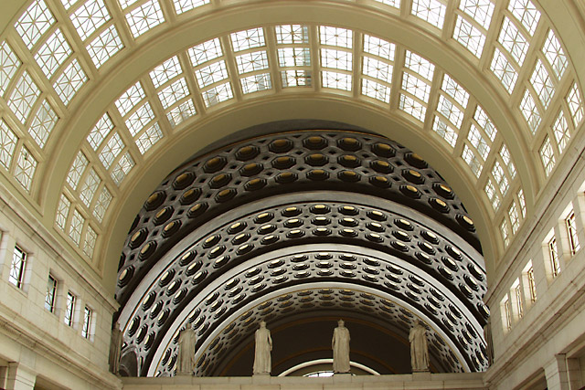
very cool. What a neat photo opportunity. The only thing I wish is that, although very close, it was perfectly symetrical - seems a little heavy/tilted on the left. good job. 8 cthenk |
|
|
|
07/18/2002 08:57:00 AM |
|
The arches are interesting, statues are not... |
|
|
|
07/18/2002 08:45:00 AM |
|
excellent example of architecture here... I love the detail and the DOF is phenomenal... in this image, I would have either tried for perfect symmetry or a heavier angle of perspective... good shot! = 8 - jmsetzler |
|
|
|
07/17/2002 06:16:00 PM |
|
|
|
07/17/2002 04:36:00 PM |
|
would have worked better centered |
|
|
|
07/17/2002 04:29:00 PM |
|
|
|
07/17/2002 01:37:00 PM |
|
good study of shapes and curves. The lack of contrasting colors makes the eye study the forms. |
|
|
|
07/17/2002 10:39:00 AM |
|
arches and architecture is good. |
|
|
|
07/17/2002 09:27:00 AM |
|
This is beautiful architecture. I just like the way it flows..the shape is very abstract. 9 - KDJohnson |
|
|
|
07/17/2002 03:45:00 AM |
|
I want symmetry! give me symmetry! :) |
|
|
|
07/16/2002 10:01:00 PM |
|
when i look at this photo, i feel like i'm leaning to the left. |
|
|
|
07/16/2002 09:47:00 PM |
|
What awesome architecture. The cropping on this bugs me a little...I don't know how you'd improve it though. 6 Lisa |
|
|
|
07/16/2002 03:31:00 PM |
|
|
|
07/16/2002 01:53:00 PM |
|
This is really nice, i would like to see the statues more clearly. |
|
|
|
07/16/2002 11:26:00 AM |
|
Way too many things to look at.Concentrate on one area,or feature of the whole. |
|
|
|
07/16/2002 02:35:00 AM |
|
nice composition, and an interesting subject. Might look better if it werer darker, so the dramatic lighting could show through better. |
|
|
|
07/16/2002 02:02:00 AM |
|
strong composition and lines-I do like this |
|
|
|
07/15/2002 09:27:00 PM |
|
Wow! Totally splendid light here! This is insanely gorgeous! |
|
|
|
07/15/2002 08:10:00 PM |
|
|
|
07/15/2002 07:28:00 PM |
|
I like your shot, looks like the camera is tilted just a hair to the left. With all of the other symmetry, level would have been better. I am thinking about putting a small bubble on my camera, seems like they ought to have that built in!! |
|
|
|
07/15/2002 04:18:00 PM |
|
Off center, terrible picture. Very bad. Just kidding. I think I'd have preferred to see it even more off center, but I don't know if that would be possible in that building. It's a lovely space and the light coming through the windows makes a very attractive color on that marble (?), but by my calculations, it's more like afternoon light, so I think your title is a bit off. I wonder if those figures are life-size...if they are it would give a nice sense of scale. But now I think they may be even larger than life size. Of course, I would have liked it better with a statue of a *mmfpfhfphh*, but you take what you can get :-) |
|
|
|
07/15/2002 04:15:00 PM |
|
|
|
07/15/2002 03:53:00 PM |
|
|
|
07/15/2002 03:47:00 PM |
|
Very nice patterns, the statues are a bit dark, but really....(nice job) 9 Swash |
|
|
|
07/15/2002 02:01:00 PM |
|
I don't like shots like this to be "just off" symmetrically. IMO, it should either be perfectly symmetrical or off by enough that the viewer can tell it's intentional. It's also a little unlevel. But it's making me dizzy and that's not an entirely bad thing. |
|
|
|
07/15/2002 01:17:00 PM |
|
Beautiful photo. Good enough to be published. |
|
|
|
07/15/2002 12:11:00 PM |
|
|
|
07/15/2002 09:28:00 AM |
|
Taking the picture perfectly in the center of the hall would have given a "perfect perspective" feeling, but maybe there's something on the way :) And with a little editing to the colors, you could have made something close to "Lone Star" by Gordon McGregor (see the Lean/How'd They Do That? topic). Anyway, good work ! |
|
|
|
07/15/2002 08:17:00 AM |
|
|
|
07/15/2002 08:13:00 AM |
|
Great shot! Just a little change: I would have rotated the picture slightly to the right. It seems a bit off balance. |
|
Home -
Challenges -
Community -
League -
Photos -
Cameras -
Lenses -
Learn -
Help -
Terms of Use -
Privacy -
Top ^
DPChallenge, and website content and design, Copyright © 2001-2026 Challenging Technologies, LLC.
All digital photo copyrights belong to the photographers and may not be used without permission.
Current Server Time: 06/28/2026 09:00:11 AM EDT.