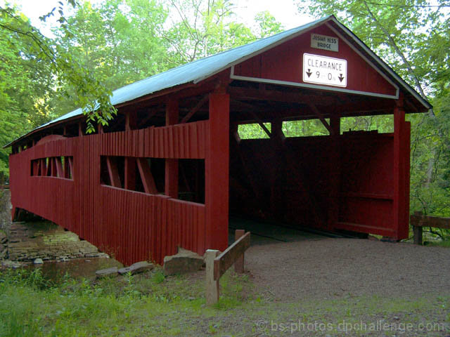
Took a couple different shots at this (angles/b&w/sepia...) I'm not sure if I picked the right one or not, had one done in sepia that I liked too, but thought that the colors seemed to really stand out in this one. Hopefully some of you think the same! ;)
Edit:
Auto Contrast/Levels/Color
Curves
Color Balance
Brightness/Contrast
Resize
Statistics
Place: 254 out of 281 Avg (all users): 4.8432 Avg (commenters): 3.9167 Avg (participants): 4.7429 Avg (non-participants): 4.9750 Views since voting: 982 Views during voting: 263 Votes: 185 Comments: 16 Favorites: 0
First, let me say that I am not a professional or even a very good amature photographer, so you may want to take my comments with a grain of salt.
Well, I do have to agree with the comments you have already received - so I will not cover that again.
I like the colors. The bridge is a nice, deep red, that makes me think of barns or old farmhouses. It matches the rustic setting that the bridge is in.
If you use Photoshop, have you tried chanel mixer? I think it can help you get more control over the colors - it might have helped with the green, to bring the color of green down a little bit to match the deeper red. I am glad you chose the color version because the color is what really attracts me about this photo.
Although a different angle may have been better in regards to the sign or the sun, I like the fact that I feel like the picture is opening up into the bridge. As if I could step inside and walk through. The tree branch in the top foreground helps add to the sense of depth.
One last note - the filesize should be as close to 150kb as possible to minimize compression artifacts.
I hope this helps! Feel free to PM me if you have any questions.
The sign is way to bright. Distrax from the whole image. The colour of the barn is ok, but the blown out sky and poor colour of the trees makes this a low score.
I thought the bridge was a bit under exposed. Would have been nice to see some detail inside of it. The "clearance" sign is very reflective and may have skewed your meter.
A little noisy for a daylight picture. The grain does not add anything to the pic. The sky is burnt and exposure killed the detail on the trees. Compositional is ok though looks tilted. 4
Too bad you couldn't have taken out the signs on the front. Anyway, compostion and angle seem all right. Image is very soft, though. Would have liked to see really sharp detail on the wood of the bridge.
The light at the top of the photo is very distracting...not enough texture. I'm guessing you were shooting into the sun, if you had the sun on the long side you'd get more texture.
Covered bridges are hard to shoot! It's a bit dark, and the top of your sky is blowing out. Sunrise and sunset are supposed to be the best times to try this sort of shot. It's too bad there's no way to get rid of the sign, as it's reflection is also distracting.






 Add photograph to your favorites
 Add photographer to your favorites

 Photographer found comment helpful.


