| Author | Thread |
Comments Made During the Challenge  |
|
|
06/04/2006 02:52:41 PM |
|
interesting, but the blown out highlight at the top is a major distraction for me. I would have error on the side of under exposure. |
|
|
|
06/02/2006 12:48:07 AM |
Using a new formula....
0-2 Meets the Challenge = 2
0-2 Technical Merit = 1
0-4 Interest/Creativity = 1
0-2 The "wow factor" = 0
Final score: 4 |
|
 Photographer found comment helpful. Photographer found comment helpful. |
|
|
06/01/2006 10:28:38 PM |
|
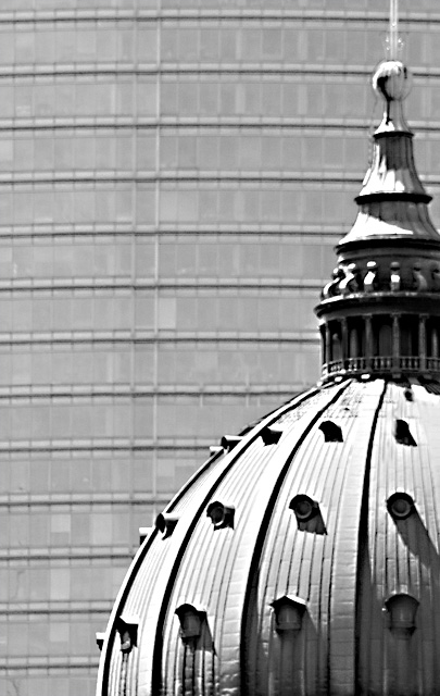
The concept here is great. However, I feel that the sharpness and focus is not that good. The peak of the tower is cut off as well. |
|
|
|
06/01/2006 05:02:40 PM |
|
Nice idea.... Black and white is probably not a very good idea and the lighting is a bit too harsh. |
|
|
|
06/01/2006 12:02:33 PM |
|
A deeper DOF would have helped. The roof a little too burnt. Wish it was sharper. Nice composition and ideea. Good luck. |
|
| Photographer found comment helpful. |
|
|
05/31/2006 07:19:13 AM |
|
The front building looks a little soft on focus. Other than that I like the composition of the shot and I like how you've filled the background with the new building. It's great. |
|
| Photographer found comment helpful. |
|
|
05/30/2006 09:43:34 PM |
|
I do like the use of contrasts here but the photographic contrast needs to be a bit stronger. Depending on what color the foreground tower is, it might also work in selective desat, with the background building left in B&W. |
|
| Photographer found comment helpful. |
|
|
05/30/2006 09:26:23 AM |
|
Interesting contrast but I think it could have been better composed. Also the light is very hard and the image is a bit blurred for my taste. 5 |
|
| Photographer found comment helpful. |
|
|
05/29/2006 12:53:22 PM |
|
I really like the juxtapostion of lines and curves, but It hink this would have been better if everything were in sharper focus. The whole picture looks a little soft. I'd also like crisper contrast. (Hard to please, aren't I???) |
|
| Photographer found comment helpful. |
|
|
05/29/2006 12:24:04 PM |
|
if your depth of field was a little deeper this would have been an amazingly striking image. Like the juxtaposition. |
|
| Photographer found comment helpful. |
|
|
05/29/2006 09:04:15 AM |
|
Home -
Challenges -
Community -
League -
Photos -
Cameras -
Lenses -
Learn -
Help -
Terms of Use -
Privacy -
Top ^
DPChallenge, and website content and design, Copyright © 2001-2026 Challenging Technologies, LLC.
All digital photo copyrights belong to the photographers and may not be used without permission.
Current Server Time: 07/01/2026 09:03:12 PM EDT.