| Author | Thread |
Comments Made During the Challenge  |
|
|
07/21/2002 11:37:00 PM |
|
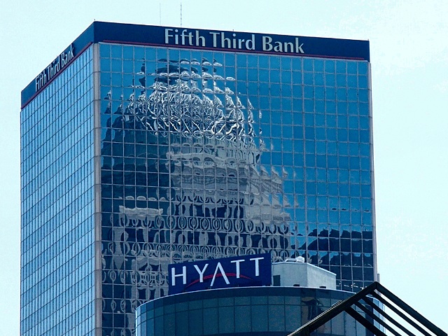
I'd like this shot better without the building names in them -- just the reflections. |
|
|
|
07/21/2002 08:39:00 PM |
|
Would have looked better if you could have cropped out the "Hyatt" and the "Fifth Third Bank". The building titles are very distracting. Great concept though. |
|
|
|
07/20/2002 06:51:00 PM |
|
I don't know about history -- might be government reflected. Of course some would say it's more a direct view of government (and its owners). |
|
|
|
07/20/2002 05:54:00 PM |
It's all about money these days, isn't it? I like how the windows diced up the other "mystery" building.
It's good I give it a nine |
|
|
|
07/20/2002 02:10:00 PM |
Great image. The coloring is great too. Good work.
Ruthann |
|
|
|
07/19/2002 01:28:00 PM |
|
Not sure I get why this is history reflected - what is the reflected building? |
|
|
|
07/19/2002 03:12:00 AM |
|
Sorry for being dumb, but I can't tell what that is in the reflection. |
|
|
|
07/19/2002 03:05:00 AM |
|
find the black bars in the right hand side distracting |
|
|
|
07/18/2002 06:27:00 PM |
|
In general a well exposed refection capture. Nice resolution and focus. Could use some more pop and would work better without the distracting bottom elements. |
|
|
|
07/18/2002 05:51:00 PM |
|
that's awesome - the reflection is incredible! |
|
|
|
07/18/2002 04:35:00 PM |
|
Haven't I seen this building before (previous challenge? too lazy to check) Nice shot, interesting window distortion. Looks like they hurried the building construction. 7 Swash |
|
|
|
07/18/2002 04:00:00 PM |
|
I like the theory, but dislike the Hyatt sign and that black thing. If you could have cropped those out I would have rated much higher. good job. cthenk |
|
|
|
07/18/2002 08:44:00 AM |
|
I would crop everything but really interesting reflection. I don't think sky, shape of the building, banner, and most of all triangle in the front improve the image in any way. |
|
|
|
07/17/2002 04:31:00 PM |
|
|
|
07/17/2002 08:27:00 AM |
|
nice reflection, cropping might have enhanced the composition more |
|
|
|
07/16/2002 10:25:00 PM |
|
get rid of the hyatt.... it would be great |
|
|
|
07/16/2002 09:11:00 PM |
|
closer cropping of image would improve this. |
|
|
|
07/16/2002 04:01:00 PM |
|
|
|
07/16/2002 03:33:00 PM |
|
i like these geometric shapes |
|
|
|
07/16/2002 02:28:00 PM |
|
Cool shot, nice reflection. |
|
|
|
07/16/2002 10:59:00 AM |
|
Can't tell what the reflection is.A little too close up. |
|
|
|
07/16/2002 10:25:00 AM |
|
I love the reflection here... this is nice :) the triangular arch at the bottom right doesn't seem fitting, but I know that this image couldn't exist without it... = 7 - jmsetzler |
|
|
|
07/15/2002 07:05:00 PM |
|
|
|
07/15/2002 04:46:00 PM |
|
Nice shot and reflection... I would have liked to see it a bit more zoomed in so it was more abstract. |
|
|
|
07/15/2002 02:34:00 PM |
|
I like this and would of ranked it higher but the 'Hyatt' section could of been left off.....it adds nothing + the text of the bank is just too much. Still over all I do like this shot, creative work. Kee |
|
|
|
07/15/2002 10:25:00 AM |
|
I would have liked to see more of the building 5 |
|
|
|
07/15/2002 01:51:00 AM |
|
I like the idea of your study, but I think it would have had more impact if the hotel in the foreground was not in the frame. |
|
Home -
Challenges -
Community -
League -
Photos -
Cameras -
Lenses -
Learn -
Help -
Terms of Use -
Privacy -
Top ^
DPChallenge, and website content and design, Copyright © 2001-2026 Challenging Technologies, LLC.
All digital photo copyrights belong to the photographers and may not be used without permission.
Current Server Time: 06/28/2026 01:22:00 PM EDT.