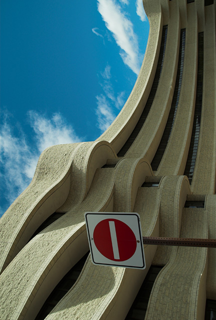
This is the museum of Civilizations in Ottawa. As you will notice, b/c of the sign, the image was rotated. The "no entry" sign totally gives it away, and might distract some i think, but I found the photo to be more effective this than just the traditional horizontal.
Statistics
Place: 175 out of 281 Avg (all users): 5.3797 Avg (commenters): 5.1538 Avg (participants): 5.3238 Avg (non-participants): 5.4512 Views since voting: 1062 Views during voting: 297 Votes: 187 Comments: 18 Favorites: 0
smyk,
For what it is worth I like it vertical like you have it. The flow of the lines just feels better to me. I looked at it horizontal and did not likt it as well.
The title is clever and a good attempt to integrate the sign in to what you want to convey. You probably have tried photoshoping out the sign and taking a look. I would try that. If you want the sign I would remove the post and the two bolts on the sign at a minimum. Better yet would be rotating the sign, after removing the post.
Challenge
- Relevant to the Challenge? Hard not to be in this one. ;)
Compostion
- Good or Bad? How can it be fixed? I don't understand why you chose to rotate the image. I might understand if the sign weren't there, but it is and ruins the flow of the building. On or the other needs to change. No Rotate or no Sign.
- Is there anything missing?
- Good use of Depth of Field? Yes. This requires a wide DOF which looks good.
- Good focus? Yes
Lighting
- Good use of light? Yes & No. I like to see more of the shadows, but the design of the building overhang might not allow for thme in that area. I love the shape of the shadows in the bottom portion.
Aesthetics/Artistic Appeal:
- Colors and Contrast. The sky has a funny tealish tint to it and seems oversaturated.
- What is my reaction or feelings? I'd like to see this on re-shot without the sign. If you do go take a ladder with you to get the weight you need toshoot over the sign...
Was this image supposed to be turned 90 degrees? If so it really doesn't work for me. If it was a mistake, then I have an issue with the shadows as they appear on the building. Either the building should be all in shadow or all in light.
Using a new formula....
Meets the Challenge = 2
Technical Merit = 0 (the sign is awful)
Holds Interest = 1
Creativity = 1
The "wow factor" = 0
Final score: 4
I think if the sign weren't there this photo would have much more impact. As it is now it just looks like what it is.....a photo turned on its side. It's similar to one I've seen on this site before....the Museum of Civilization, right?
This would of been a great image if you had just the building. Framing out the sign, and the sky would of given a better impression of what you were after. As it is, I know which way is up, therefor all i see is a picture the wrong way.
Nice lighting, great texture, good color, great lines, sign distracting







 Add photograph to your favorites
 Add photographer to your favorites

 Photographer found comment helpful.


