| Author | Thread |
|
|
06/06/2006 06:32:03 PM |
Unofficial Extra Critique Club Comment
I think it is something to do with some sweets from childhood called Spangles that makes me love this colour - I have at least two challenge entries using this shade;) Or may be I'm in the matrix? So I'm in love with your entry before I even start!
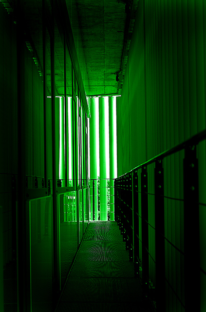
There are so many different textures here: That lovely moire type pattern on the metal is really nice. The rivets on the right hand guard rail are nicely highlighted. The vertical lines on the right wall. The glass and reflections of the left hand wall and the stippled ceiling tiles. A true selection box!
The eye is definitely drawn towards the light here, as though it's as escape route from the matrix! The different lines do make you stop and look along the way out though, so the image holds the viewer's attention.
The focus is wonderfully crisp and the septh of field does it's job well.
As for meeting the challenge - some architect obvioulsly put a lot of thought and design into this small space; to say it doesn't scream architecture is a little harsh.
A wonderfully interesting image! |
|
 Photographer found comment helpful. Photographer found comment helpful. |
|
|
06/06/2006 05:41:27 PM |
Unoffical Extra Critique Club
Well looks like you had the last image in the que. I like the green kinda matrix look to this and I guess that is what you were after. I also like how the walkway seems almost like tv screens. I really like how all the lines lead my eye to the center of your image. Nicely done. I really like the depth of field. I like that some of the railing close to the viewer is out of focus. Very nice image. |
|
| Photographer found comment helpful. |
|
|
06/06/2006 05:37:07 PM |
Unofficial Critique Club Critique
First, let me say that I am not a professional or even a very good amature photographer, so you may want to take my comments with a grain of salt.
Meeting the Challenge: It doesn't scream "architecture" to me right away, but even still I feel it definitely does meet the challenge. Many others probably disagreed with me. (edit to explain: The actual space is of course a wonderfully fine example of archetecture. I just mean that with the colors how they are, and with the reflections, it may be hard to tell at first glance, or from the thumbnail, that this does meet the challenge.)
Composition: I like how the main, "highlighted" portion is off centered while still feeling very balanced. The lines in the photo really appeal to me, and unlike a previous commenter, I like the patterns on the floor.
Lighting: Good. I can see plenty of details. The only thing I'd suggest, perhaps, is a bit brighter foreground to pull out the details there, although I can't make up my mind if this would be an actual improvement.
Color: I love what you have done in postprocessing.
Title: Describes the picture without stating something obvious. To me, that makes a great title. The title describes the effect you've achieved perfectly, in my opinion.
Image Dimensions and Filesize: No problems here.
Misc / My subjective thoughts: I love green, so your image pulls me in immediately. I think it is a bit of a unique photo for something like this, and maybe with something more traditional you would have scored higher in this challenge. However, I am glad you entered what you did, and it is definitely going in my favorites.
I hope this helps! Feel free to PM me if you have any questions.
Message edited by author 2006-06-06 18:56:09. |
|
| Photographer found comment helpful. |
|
|
06/06/2006 05:32:49 PM |
::: Greetings from Critique Club :::
Hi, as requested, here is an indepth critique of your submission.
Oh and I have good news. Your photo is the last entry in the CC queue. It's the first time we've emptied the queue. So you get something special with this photo.
First Impression - the most important one:
This shot does take a lot of look of The Matrix movies and I think it's pretty neat looking. Definitely a creative take on window blinds :-)
Composition:
Interesting. I like how you have made the corridor lead to the end of the hall. Definitely draws the eyes down the corridor.
Subject:
Not really applicable to this shot.
Technical (Color, focus, and light):
Color: Definitely works for what you were trying to do.
Focus: Seems sharp and DOF is deep enough to work for you.
Light: I like how it falls off as it comes toward the camera. Very nice effect.
To grow its vote?:
I'm not sure that it worked for the voters. It's less of an "architecture" shot than most would expect.
Summary:
Creative entry and shows competence on your part. Keep up the nice work.
Hope to see more from you soon,
Leroy |
|
| Photographer found comment helpful. |
Comments Made During the Challenge  |
|
|
06/04/2006 05:24:45 AM |
|
Looks like a fair amount of noise in this image... |
|
|
|
06/03/2006 08:09:45 PM |
|
Now this is cool. What is it? |
|
|
|
06/03/2006 03:40:27 AM |
|
cool! I like the darker 'border' and love the green, bump 9 |
|
| Photographer found comment helpful. |
|
|
06/01/2006 10:20:08 PM |
Using a new formula....
Meets the Challenge = 1
Technical Merit = 2
Holds Interest = 1
Creativity = 1
The "wow factor" = 0
Final score: 5 |
|
| Photographer found comment helpful. |
|
|
05/31/2006 09:12:52 AM |
|
The green is neat, but I have a hard time getting a sense of where I am/what I'm looking at here. It's a bit confusing. |
|
| Photographer found comment helpful. |
|
|
05/30/2006 08:34:18 PM |
|
| Photographer found comment helpful. |
|
|
05/29/2006 07:26:54 AM |
|
You should try a different resizing method to get rid of that Moire pattern on the floor. |
|
| Photographer found comment helpful. |
Home -
Challenges -
Community -
League -
Photos -
Cameras -
Lenses -
Learn -
Help -
Terms of Use -
Privacy -
Top ^
DPChallenge, and website content and design, Copyright © 2001-2026 Challenging Technologies, LLC.
All digital photo copyrights belong to the photographers and may not be used without permission.
Current Server Time: 07/01/2026 12:33:58 AM EDT.