| Author | Thread |
|
|
06/06/2006 03:48:21 PM |
smyk,
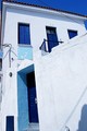
For what it is worth I like it vertical like you have it. The flow of the lines just feels better to me. I looked at it horizontal and did not likt it as well.
The title is clever and a good attempt to integrate the sign in to what you want to convey. You probably have tried photoshoping out the sign and taking a look. I would try that. If you want the sign I would remove the post and the two bolts on the sign at a minimum. Better yet would be rotating the sign, after removing the post.
Just my honest opinion. Thanks for the picture.
Bruce
|
|
 Photographer found comment helpful. Photographer found comment helpful. |
|
|
06/06/2006 02:59:48 PM |
oooo Greeting from the Critique Club oooo
Challenge
- Relevant to the Challenge? Hard not to be in this one. ;)
Compostion
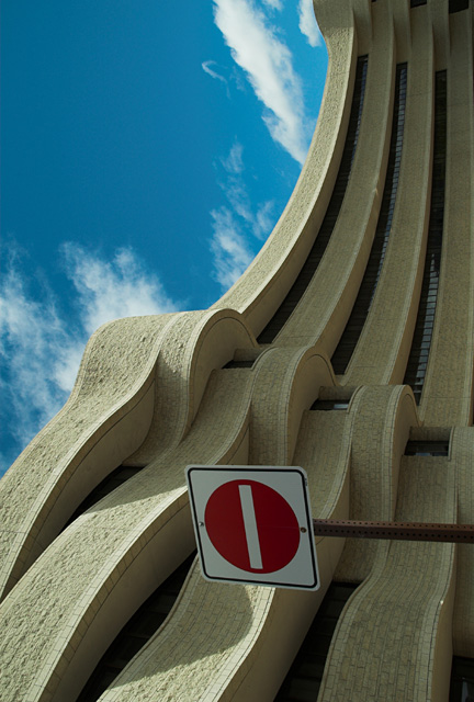
- Good or Bad? How can it be fixed? I don't understand why you chose to rotate the image. I might understand if the sign weren't there, but it is and ruins the flow of the building. On or the other needs to change. No Rotate or no Sign.
- Is there anything missing?
- Good use of Depth of Field? Yes. This requires a wide DOF which looks good.
- Good focus? Yes
Lighting
- Good use of light? Yes & No. I like to see more of the shadows, but the design of the building overhang might not allow for thme in that area. I love the shape of the shadows in the bottom portion.
Aesthetics/Artistic Appeal:
- Colors and Contrast. The sky has a funny tealish tint to it and seems oversaturated.
- What is my reaction or feelings? I'd like to see this on re-shot without the sign. If you do go take a ladder with you to get the weight you need toshoot over the sign... |
|
| Photographer found comment helpful. |
Comments Made During the Challenge  |
|
|
06/04/2006 05:27:43 PM |
|
This is an excellent shot with great lines and shapes. |
|
| Photographer found comment helpful. |
|
|
06/03/2006 08:24:54 PM |
|
Was this image supposed to be turned 90 degrees? If so it really doesn't work for me. If it was a mistake, then I have an issue with the shadows as they appear on the building. Either the building should be all in shadow or all in light. |
|
| Photographer found comment helpful. |
|
|
06/03/2006 09:22:48 AM |
|
| Photographer found comment helpful. |
|
|
06/02/2006 10:39:11 AM |
|
C'est la Musee de Civilisation in Hull, eh? |
|
|
|
06/02/2006 02:38:07 AM |
|
The Museum of Civilization is always a good choice for architecture due to it's uniqueness. Interesting angle you chose. |
|
| Photographer found comment helpful. |
|
|
06/01/2006 10:21:36 PM |
Using a new formula....
Meets the Challenge = 2
Technical Merit = 0 (the sign is awful)
Holds Interest = 1
Creativity = 1
The "wow factor" = 0
Final score: 4 |
|
|
|
05/31/2006 10:06:38 PM |
|
| Photographer found comment helpful. |
|
|
05/31/2006 08:30:38 AM |
looks like the kosmikkreeper building :)
the sky has an odd hue, I would like more blue in that may be |
|
| Photographer found comment helpful. |
|
|
05/30/2006 12:50:54 PM |
|
very creative use of composition. |
|
| Photographer found comment helpful. |
|
|
05/30/2006 12:40:37 AM |
|
The Dead end sign kind of ruins it. |
|
| Photographer found comment helpful. |
|
|
05/29/2006 02:55:41 PM |
|
I think if the sign weren't there this photo would have much more impact. As it is now it just looks like what it is.....a photo turned on its side. It's similar to one I've seen on this site before....the Museum of Civilization, right? |
|
| Photographer found comment helpful. |
|
|
05/29/2006 09:22:11 AM |
This would of been a great image if you had just the building. Framing out the sign, and the sky would of given a better impression of what you were after. As it is, I know which way is up, therefor all i see is a picture the wrong way.
Nice lighting, great texture, good color, great lines, sign distracting |
|
| Photographer found comment helpful. |
|
|
05/29/2006 08:43:11 AM |
|
Love the architecture but I really dont like the sign. I also like that you turned the building on end like it was reaching to the sky. |
|
| Photographer found comment helpful. |
|
|
05/29/2006 07:22:33 AM |
|
The illusion of flowing lines would work better without the clouds and the sign giving away the perspective so abruptly. |
|
| Photographer found comment helpful. |
|
|
05/29/2006 02:59:00 AM |
|
Clever rotation,really like in the normal poition.....5 |
|
| Photographer found comment helpful. |
|
|
05/29/2006 01:26:04 AM |
|
I like this better in its more earthly portrait orientation. |
|
| Photographer found comment helpful. |
Home -
Challenges -
Community -
League -
Photos -
Cameras -
Lenses -
Learn -
Help -
Terms of Use -
Privacy -
Top ^
DPChallenge, and website content and design, Copyright © 2001-2026 Challenging Technologies, LLC.
All digital photo copyrights belong to the photographers and may not be used without permission.
Current Server Time: 07/01/2026 03:10:45 AM EDT.