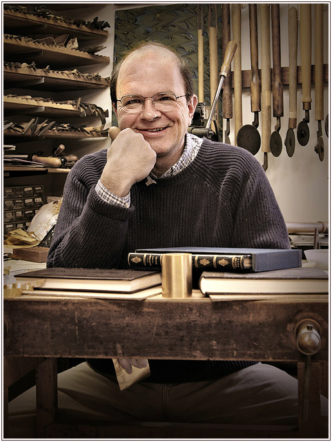
Color image contrast masked, healing brush on shiny dome, hue/sat, sharpened, Image duplicated
Duplicate image converted to B/W in red channel, tone adjusted with hue/sat "colorize", some local dodging and burning, overly of vignetting plus several gradients added and faded, entire B/W image copied and pasted over color image
Combined image, B/W image faded in normal mode to allow some color through. Gradient/vignette overlay copied and pasted on top of this and faded in multiply mode.
Resize, sharpen, border, save for web.
Statistics
Place: 4 out of 190 Avg (all users): 7.2342 Avg (commenters): 7.8966 Avg (participants): 7.1351 Avg (non-participants): 7.2838 Views since voting: 8772 Views during voting: 371 Votes: 222 Comments: 58 Favorites: 11 (view)
You know what's funny? It's really not a very striking image. It doesn't pop. It doesn't have bright flashy colors. Or crazy effects. It doesn't have some heart-stopping beauty with lips that would a blind man cry.
It's the photographic equivalent of a warm, soft sweater.
I cannot even count how many times over recent years I have recollected this image and tried to learn from it or apply it to something I am doing. It is such a clean and pure example of how to do a photo just right.
Maybe it's weird, but when I think of Bear, I think of the steamed seafood on the East Coast, I think of a guy hiking in the mountains hauling a huge-arse wooden tripod with a large format camera, only to lose it over a soft embankment, spilling noiselessly into some remote valley, but ultimately preserving that with real value. I think of a guy who loves landscapes and can work magic with a 20D and a non-L APS-C lens.
And when I think about portraits - environmental portraits. I think of Jim Talin and bear. What would be a simple snapshot for some is a carefully planned, immacculately executed combination of function and expression.
It's always there in my mind as a reminder of what I need to do to do it right.
If I'd voted on this challenge, this would have been my choice for blue. I really love this image. I've seen it before, but since I stumbled across it again, I thought I should leave a comment. I don't think a photographer really gets to choose their own photographic style - basically they develop a style over time through experience. But if I could choose my own style - I'd like to shoot images like this.
Great shot; just the right expression- one of 2 ways to go with this- serious st work, or personality. I like the tools behind and the placement behind his head. I also dig the full frame and the under teh table look. Great workplace portrait of a craftsman.
I havent really gone through your portfolio thouroughly before as i'm not a huge landscape fan and I was amazed by this photo during the challenge but I also just found your photos "Gretchen, Mark, Rosie Jack — 3 Generations in Sunset Light" and "Happy Winner". All three of these are beautiful. I know landscape and floral are your confort zones but I REALLY love your portrait work. I hope to see more of it in the future. :)
Very, very nice, Robert. Good to see a picture on your top row that doesn't have water or a skiff in it. :-) Note that you received only 2 votes 4 or below - that alone is an amazing stat. Masterfully done from the angle and lighting of the capture to the wickedly complicated post-processing - how do you know when you're done?
Congratulations on adding another ribbon to your collection Robt. I should have guessed it was yours from the quality of the lighting and post processing. One of my top picks for blue ribbon.
First of all, congrats on the 4th place (fingers crossed if someone from the top 3 gets DQ'ed, lol!) A very close one, Robt!
The DOF control is nice - just shallow enough to give the books and the table in front a sense of depth. And I like the simple border you used here, very suitable.
Very unusual talent to photograph, I really like the set-up and the easy expression of the model. Only part that bothers me are the hands, it looks like he is holding a tool but on first glance thought it was a big funny thumb and the lower hand maybe should stay postioned behind the table. 7
Very excellent environmental portrait, it shows the man very well and also what he does without overwhelming him. I think it might look good with more of the bottom cropped off as well - so you couldn't see his hand hanging under the table.
Very nice, I may have been to strict with most of the submissions but this is one of the few that really meet the challenge as far as I am concerned, this is a classic definition of an environmental portrait. Love it, nicely lit and post processing is good, 8 from me.
I think there are better shots than what you have here ,. I grant that you have excently put him in the workplace, my worries are that it is static, the hand looks too large and misshappen why not have him perched on the workbench holding a tome or two,
having had some association with this trade there is a lot of wealth here to be had maybe holding some tools of trade I could have a ball here . 6
Now this is just whaat the challenge ordered. The environment is interesting and you have ensured that we can see that by lighting and including it in focus. the lighting here is brilliant. I know it looks casual and it might be but it is even across the whole portrait including the subject with just a stop difference. I don't know if this is going to score well but it should for it extreme technical competence. I was going to be bugged by the centreed composition but the overall effect of he image over-rode that. This deserves to be a full page illustration in a magazine article
Very interesting portrait. Makes me want to poke around the shop and look at all of those tools. I like the tones and the restrained color. Nice documentary image.
One of the better ones after 15% voting. Sharp - good lighting - too the point and not overdone in any way - 10 points from me!
Only thing I woud have done differently would be to hide the hand under the desk. But these things usually only comes to mind during post edit - not when you set up the pose.
Nice lighting and over all color tones. The hand under the table is a distraction, as his the way his legs are spread on the stool. I woud suggest cropping to the bottom edge of the table top. (8)






 Add photograph to your favorites
 Add photographer to your favorites

 Photographer found comment helpful.


