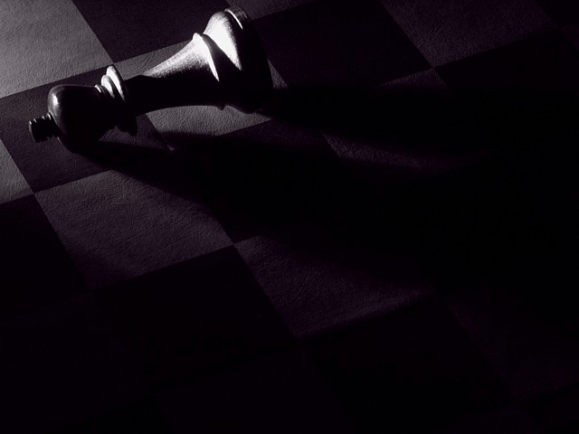
Nice lighting, but maybe too dark. There is way too much of the image that has nothing to look at. Maybe that was a choice, but as a viewer it, IMO, would have been more interesting to see a faint amount of texture or shape in the shadows.
The dark tones and dramatic lighting work with the subject of a lone chess king on its side to form a vivid image of defeat. Not quite desolation, which to my mind is more permanent than a lost game, but I guess it works in a symbolic way. Great use of negative space.
I like this composition a lot. I'm surprised that so much can be conveyed in what amounts to a small proportion of the image through the use of lighting. Really nice!
One of the more creative submissions in this challenge. Great use of lighting. The The focus on the head of the king seems a bit soft. This might have benefitted from a border.







 Add photograph to your favorites
 Add photographer to your favorites


 Photographer found comment helpful.


