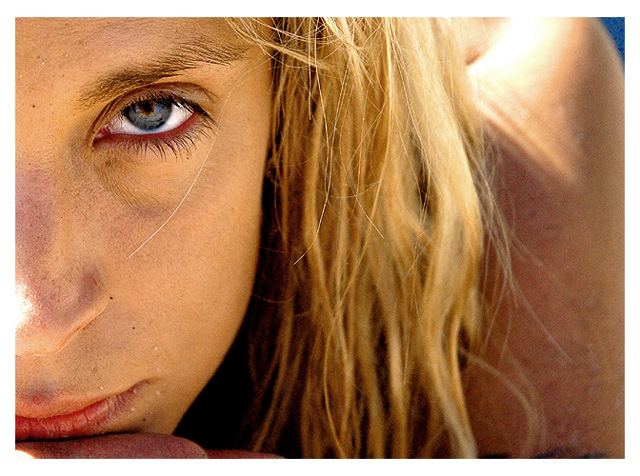
i gave this shot a 10....common people, what didn'T you like about this lovely shot?
It's a lovely shot, it just DNMC.
i agree with you. i think at submission time, i just saw it and thought perhaps I could adjust saturations enough to make it appear complementarily colored.
Oh well. Below average, but I got many good complements on it.
yeah, seems a bit low. whatever. i got paid for the shoot, and a variation of this photo will be in a magazine, along with another 11 pages and a cover shot for the magazine's swimsuit edition. Can't name the magazine, nor do I feel the need to validate my claim, so there.
:)
I guess what I'm saying is, take your 4.8 and STICK IT! lol
Not blue or orange enough for me (I wouldn't think of those colors without the title). I like her face and hair, but wish the right side was sky or some solid color.
This a fantastic portrait but unfortunately dosen't fit the challenge at all. You shouldn't need to specify in the title what colors you are going for. Aside from that, I wish this was part of my portfolio.
dont see the orange and im guessing blue was hey eye.
its good that you specified what you were going for sadly IMO unattaigned. there was alot of potnetial though.. title doesnt add to the photo. 3.
Nice sharpness in the eyes. I would crop out the shoulder, it is not reading really well IMO. Also, you are probably going to get pushed due to your liberal interpretation of the challenge. Nevertheless, the subject connects really well with the viewer.
One of the best photos I've seen in some time. Everything from the bits of sand around the mouth, the wayward strands of hair, beautiful color of the eye, the pose, the crop.....I am new to the mechanics of photography and editing in PS. I question my worthiness at times to issue critiques. Those pics that I have entered that I thought were great, landing 3's, 4's and 5's, are the stepping stones to my learning to create something just as this.But I have learned enough so far to know when something "pops", and this is a stick of dynamite!!! Wonderful job!
2 - Way too subtle in my opinion, plus the main color I first see is 'yellow'. Perhaps a tweaking of the eye, and more blue in the background, not sure, still be a bit of a stretch in my opinion.






 Add photograph to your favorites
 Add photographer to your favorites


 Photographer found comment helpful.


