| Author | Thread |
Comments Made During the Challenge  |
|
|
05/02/2006 02:12:37 PM |
|
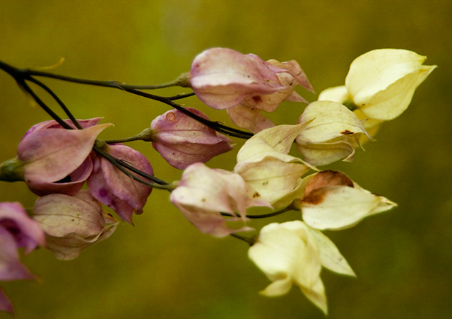
Very gentle, if a touch out of focus. But is it complementary colours? |
|
 Photographer found comment helpful. Photographer found comment helpful. |
|
|
05/02/2006 02:28:40 AM |
|
eye doesn't get drawn anywhere |
|
| Photographer found comment helpful. |
|
|
04/30/2006 10:02:05 PM |
|
| Photographer found comment helpful. |
|
|
04/30/2006 07:17:23 PM |
|
Very, very beautiful image. |
|
| Photographer found comment helpful. |
|
|
04/30/2006 06:44:56 PM |
|
nice... the background is almost like a selectively faded backdrop |
|
| Photographer found comment helpful. |
|
|
04/30/2006 05:37:28 PM |
I like the vintage look to this shot, not cliche at all-- It works for me- 8
Edit second look-- bumping to a 9 |
|
| Photographer found comment helpful. |
|
|
04/30/2006 02:48:44 PM |
|
| Photographer found comment helpful. |
|
|
04/30/2006 09:08:35 AM |
|
doesnt fit the challenge enough |
|
|
|
04/29/2006 04:43:46 AM |
|
trying to fgiure out where the compliments are in this image. |
|
|
|
04/29/2006 02:58:03 AM |
|
| Photographer found comment helpful. |
|
|
04/28/2006 03:19:27 AM |
|
This is a beautiful photo, but I would have liked to see more purple... the yellow-ish color is very dominating. 6 |
|
| Photographer found comment helpful. |
|
|
04/27/2006 09:32:27 PM |
|
5 - Like this. Like to have seen the colors tweaked - almost two 'schemes' here in my opinion. Like to have seen one or the other 'stronger'. |
|
| Photographer found comment helpful. |
|
|
04/27/2006 04:48:39 AM |
|
the photo lacks some interest, the top-right flower is too bright and most of these flowers are not in focus either |
|
| Photographer found comment helpful. |
|
|
04/26/2006 10:59:36 PM |
|
| Photographer found comment helpful. |
|
|
04/26/2006 06:07:41 PM |
|
Nice shot, but the colours aren't popping... a bit more saturation would help this (maybe). Other than that, nice composition. |
|
| Photographer found comment helpful. |
|
|
04/26/2006 12:56:49 PM |
|
It's a nice image, but just doesn't have any pop for me. |
|
| Photographer found comment helpful. |
|
|
04/26/2006 06:03:41 AM |
|
ok...want to be nice, but the only good thing is the bokeh of the lens...the rest is quite flat and lacks colour |
|
Home -
Challenges -
Community -
League -
Photos -
Cameras -
Lenses -
Learn -
Help -
Terms of Use -
Privacy -
Top ^
DPChallenge, and website content and design, Copyright © 2001-2026 Challenging Technologies, LLC.
All digital photo copyrights belong to the photographers and may not be used without permission.
Current Server Time: 06/28/2026 07:44:18 PM EDT.