| Author | Thread |
Comments Made During the Challenge  |
|
|
07/14/2002 08:50:00 PM |
|
Now that's fear! Nice interpretation of the challenge topic. |
|
|
|
07/14/2002 12:06:00 AM |
|
heh, good interpretation of fear |
|
|
|
07/13/2002 08:29:00 PM |
|
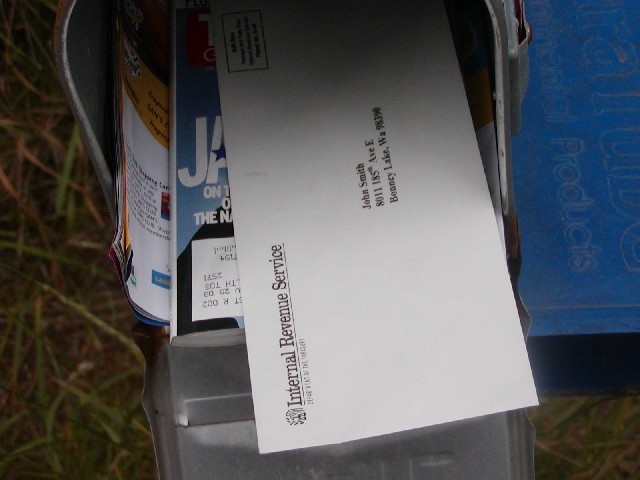
fear of the taxman? ok. challenge met ;-) but somehow the photo looks a bit boring. |
|
|
|
07/13/2002 10:20:00 AM |
|
The addresses don't match. Look like a reprieve from the postal delivey person. |
|
|
|
07/12/2002 01:54:00 PM |
|
creative 9 interesting 4 focus 7 framing 8 = 7 |
|
|
|
07/11/2002 07:08:00 PM |
|
|
|
07/10/2002 02:49:00 PM |
|
Good composition and focus. I don't know if it would make it better or not, but maybe an angle slightly sideways to the mailbox, so that the mailbox fills up the frame that the letter doesn't. With the paper box on the right, it seems somewhat unbalanced. karmat |
|
|
|
07/10/2002 01:57:00 PM |
|
subject 6 composition 7 lighting 7 focus 7 |
|
|
|
07/10/2002 05:10:00 AM |
|
I thought about doing something like this (your title was my subtitle), but went with another idea instead. I think your photo quality is better; I still kinda like my layout (it's posted as an outtake in one of the forums) -- I did that before I saw this one... |
|
|
|
07/10/2002 01:07:00 AM |
|
getting that notice from the IRS does send the fear of God into you, doesn't it? |
|
|
|
07/09/2002 10:42:00 PM |
|
great picture, great imagination! |
|
|
|
07/09/2002 10:23:00 PM |
|
fear indeed :) I think a little more light would be nice... = 7 - jmsetzler |
|
|
|
07/09/2002 06:01:00 PM |
|
Awsome idea, but I would have worked on the lighting to make it more dramatic |
|
|
|
07/09/2002 04:28:00 PM |
|
sorry here nothing to fear for me |
|
|
|
07/09/2002 12:15:00 PM |
|
|
|
07/09/2002 09:53:00 AM |
|
|
|
07/09/2002 07:49:00 AM |
|
Nice idea, photo is a trifle dark. |
|
|
|
07/09/2002 12:40:00 AM |
|
|
|
07/08/2002 10:33:00 PM |
|
Brrrr, that's scary! I like the magazine under the letter. The two letters showing could be the start of 'Jail'. Good job technically, unlike 90% of the entries this week, yours actually has adaquate DOF. Shey. |
|
|
|
07/08/2002 06:54:00 PM |
shudder, IRS.....Well, John, focus is good, composition/framing O.K. Nit time: What is the blue mat to the right and why is it in the frame? Try using a fake address, too, like florida, if you are going to "not let us know who you are", Tom.
8 Swash (you should have done the shotgun wedding shot!) |
|
|
|
07/08/2002 02:31:00 PM |
|
|
|
07/08/2002 01:03:00 PM |
|
Clever, creative work. Nicely done. Kee |
|
|
|
07/08/2002 09:16:00 AM |
|
I had the same idea! Your execution is much better than mine was. Good job! |
|
|
|
07/08/2002 09:05:00 AM |
|
Home -
Challenges -
Community -
League -
Photos -
Cameras -
Lenses -
Learn -
Help -
Terms of Use -
Privacy -
Top ^
DPChallenge, and website content and design, Copyright © 2001-2026 Challenging Technologies, LLC.
All digital photo copyrights belong to the photographers and may not be used without permission.
Current Server Time: 06/29/2026 06:28:18 AM EDT.