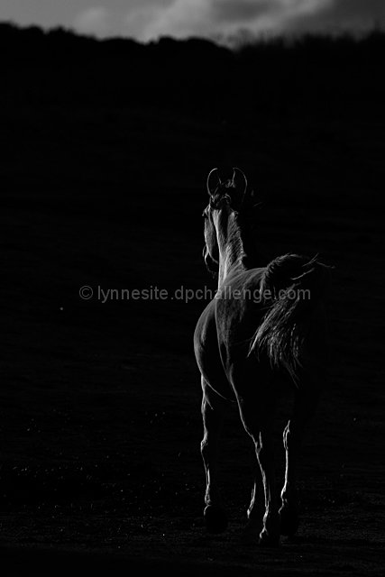
Shot into the setting sun to get the edges lit on my willing model. Knocked the exposure down in RAW, used Greg Gorman's LAB/color fill technique to convert to black and white and get the "pop", since this is a basic challenge. Too bad about the dead pixel. :-(
--
post challenge, here was my conversion technique, Greg Gorman. The chosen color was, of course, black, I did steps 1-11.
.
BLACK AND WHITE CONVERSION
1. Open a color Image in Photoshop in either 8 or preferably 16
bit (Photoshop CS)
2. Under the Image menu, choose Mode>Lab
3. Click (Highlight) the Lightness Channel
4. Under Image menu, choose Mode>Grayscale (Discard Color
Information)
5. Command/Control Click on the Gray Channel (to load the
selection)
6. Under the Select Menu, choose Image>Inverse
7. Under Image menu, choose Mode>RGB Color
8. In the Adjustment Layers Palette choose Solid Color
9. Select a color from the Color Picker or from the Swatches
Palette (which I prefer)
10.Your choice of color should be based on the tonal range you
wish to see in your final B&W
11. Go to your Layers Palette and change your Blending Mode
to Multiply
12. Because your Color Fill is on a Layer you may adjust the
opacity to dial back the color to your desire
13. In addition (IMPORTANT), you may add a Curves or
Adjustment to achieve the desired contrast
14. Should you wish to change the color of your B&W
“Duotone” simply Double Click the Color Fill and reselect
Disqualification Details
Adjustment Layers must be applied in Normal mode. All other blending methods (modes) are prohibited. Please review the challenge submission rules.
Statistics
Views since voting: 1906 Views during voting: 344 Comments: 36 Favorites: 13 (view)
This was one of my highest rated ones in the challenge. Still a wonderful capture. I'm pretty sure one of your pictures will be on the front page soon!
This is just such a great shot. Terribly disappointed for you that it didn't ribbon. The 3 ribbons are most deserving but this shot is just spectacular. I gave it a 10 and thought for sure it would be on the front page. Congratulations, though. You should be so pleased with the result. Nic.
Congrats Lynne, I havent been on much in the past few weeks and havent voted for three weeks so didnt see the entries for this but it is stunning!! Would definitely have got a 10 from me LOL
im of the opinion that you could have cropped out the sky in this pic. Its such a great capture of the horse's shape that it doesn't seem as if the sky adds anything. just my opinion :) 8.
edit to add: After looking at this pic with and without the sky i believe your framing choice is correct. The sky provides some basis for the lighting on the horse. good job. 9
Absolutely beautiful.
If only spot editing were allowed, there is just one light spot about half way up on the left that bothers me. You still get a 10, though :)
THIS is what low key means in my opinion. Wonderful. The noise in the photograph on the left side (I think it's noise) is a little distracting but this is still my favorite.
I love the hint of light on the horse. I think I'd crop out the sky altogether. It makes it have an even moodier sense, like "where is he and where is he going." I like the off center of the horse and the use of space to the left.






 Add photograph to your favorites
 Add photographer to your favorites

 Photographer found comment helpful.


