wow what a twisted shot. the color cast drains a bit of the sexiness out of it, but i like the daring you show submitting this to this rather prude site!
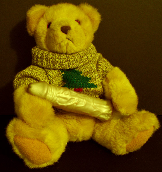
I see the contrast:) and for some this is a truth. but for others it is offensive. I had rated this a two the first go round but after revisting I felt my judgement to harsh. what does not seem to be right, is the contrast with the bear, it seems to dark to me. what also seems inconsistant is the harsh light that is falling on the sex toy but it remains dull. over all the picture could be a little brighter. good luck 4
Your title's a bit misleading here but I suppose you can't get much more contrast than a [female?] teddy and a dildo! Image is too yellow and a bit soft, thus the lower score. [4]
huh? absolutely ridiculous. not to say that i don't find it amusing, it's just not really a good photo. take a good photo with these elements in it and you'll get a good score. The lighting is just horribly mushy with a bad glare on the dildo and it has a bad yellow cast that could easily be fixed with a little levels adjustments. basically, it's boring even though it is supposed to be shocking. Try some closeups of him stroking it or wearing it or something. The blur in the fur is bad and the compositions and shadows don't help either. trying to be helpful here, sorry if it comes off as rude, i just think your set-up and idea could have led to some really inspiring photos. :)
While I appreciate the attempt at humor, this is in pretty poor taste, especially considering that some of the voters are children. You did a great job of juxtaposing two contrasting icons, but it just seems rather crude and base.
Interesting concept. I see the contrast of age and growth, not alot of it compositionally. The color seems off. Might be the brownish color to the background and the yellowish color of the bear and vibro together.
interesting to say the least. The photo is kinda yellow, I don't know if that was the lighting or if it was intentional or not. I would have liked to see truer colors. Maybe if you had something other than the black background it would have given it a better feel, like have it set up on a childs blanket or quilt or on a bed or in a crib or something.
I think this is in very poor taste. Now that i'm over the 'poor taste' factor involved in this photo, I should probably discuss the photograph itself... Compositionally, it's fine.. the only element of the composition that I don't care for is the feeling that the bear is floating is space with no visible surface... Technically, I don't like the yellow tungsten glow on this one... i don't know if that was intentional or not, but it can easily be corrected or shifted with white balance adjustents in cam or with software in post processing...





 Add photograph to your favorites
 Add photographer to your favorites


