| Author | Thread |
Comments Made During the Challenge  |
|
|
02/21/2006 11:45:08 AM |
|
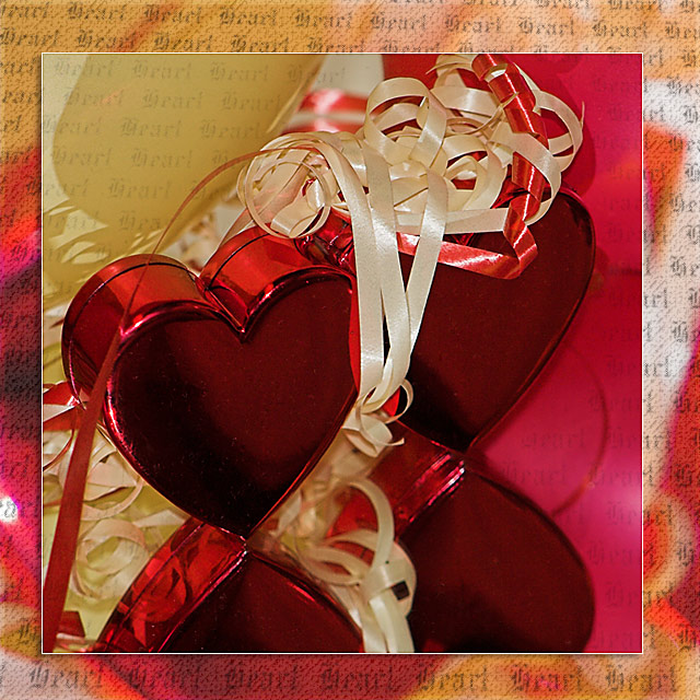
Nice idea. Some of the ribbon is distracting - doesn't feel cohesive. |
|
 Photographer found comment helpful. Photographer found comment helpful. |
|
|
02/18/2006 10:16:41 PM |
|
| Photographer found comment helpful. |
|
|
02/18/2006 10:10:47 PM |
First Impressions:
Nice image. I can see what you are aiming for, and I think you've got there.
Lighting:
Generally pretty good. The lighting on the heart boxes(?) looks about right, but if anything the ribbons look a little hot. I'm assuming this was flash, so you'd only really have decent control if you shot in RAW. Would the hearts have survived any less light? There's no burnout on the mirror, which is good. Perhaps some backlight would have helped? Maybe a slave flash?
Focus/DOF:
Seems pretty sharp most of the way through. Part of me wonders whether this would look good as a more 'dreamy' image, with a much shallower depth of field. As a card, however, it could well not look right.
It appears to me that the 'mount' for the photo (i.e. the border) is an out of focus duplicate of the photo itself, which I think is about right. It has the right colours and feel, and has a presence without being too distracting.
Color:
On the whole seems good. There is an even balance, without looking too bland. The colours aren't muted, but at the same time not over-saturated. I've never been a fan of that 'metallic' red you get on those trinket boxes and the like, but there's obviously very little you could do about that.
Composition:
It feels good. Couple of nitpicks however. I would prefer to see all of the ribbon in the upper right part of the image. It feels a bit squashed.
I also would have tried to have the boxes facing the other way to try to avoid the shadow around the lids. Although having said that, there may have been something on the lids you were trying to avoid.
My only other issue with the picture is the 'heart' watermark. I think it's cracking on the 'mount' but think it's too distracting on the photo itself. I also feel that it would look better either entirely level, or a lot more 'on the skew', so it looks completely intentional (which I'm sure it was).
Meeting the Challenge:
It does that. The rules were very non-specific, but it definitely covers them. It feels very valentine's-ey, and has a warm feel to it. I'd probably buy it in a shop as a card. So I guess that means it fits your intentions pretty well too.
Hope it does well for you.
Mark |
|
| Photographer found comment helpful. |
|
|
02/18/2006 09:36:30 PM |
|
The first thing that comes to mind here is...well done. The second is...OVER done. Everything is just a little TOO much. I think I would have liked this shot a lot better without the blurred decorative border. Let the objects speak for themselves. They're nicley and dynamically arranged. As a photograph, they already have interesting things to say. The border and the screened back text scream to me..."I'm not just a photographer! I"m also a Graphic Designer!" That's not a bad thing, necessarily, but in this case, it detracts. |
|
| Photographer found comment helpful. |
|
|
02/17/2006 11:01:54 AM |
|
Pretty, I like the border/background a lot |
|
| Photographer found comment helpful. |
|
|
02/16/2006 06:51:25 PM |
|
Nice postprocessing work! |
|
| Photographer found comment helpful. |
|
|
02/16/2006 05:50:16 PM |
|
| Photographer found comment helpful. |
|
|
02/16/2006 09:50:29 AM |
|
Very classy in a greeting card sort of way. I love the colors and textures. |
|
| Photographer found comment helpful. |
|
|
02/16/2006 08:14:29 AM |
|
What a lot of work, but worth it as this is good....."WOW" factor from me. |
|
| Photographer found comment helpful. |
|
|
02/15/2006 09:51:46 AM |
|
| Photographer found comment helpful. |
Home -
Challenges -
Community -
League -
Photos -
Cameras -
Lenses -
Learn -
Help -
Terms of Use -
Privacy -
Top ^
DPChallenge, and website content and design, Copyright © 2001-2026 Challenging Technologies, LLC.
All digital photo copyrights belong to the photographers and may not be used without permission.
Current Server Time: 07/01/2026 03:52:33 PM EDT.