| Author | Thread |
|
|
05/07/2006 10:05:01 AM |
|
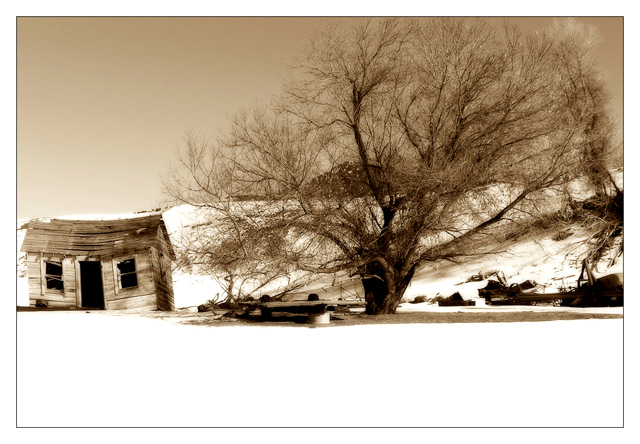
something I like about this shot. Cant put my finger on it. Seems eerie and desolate. Anyway fab photo!! |
|
|
|
02/28/2006 10:18:38 PM |
|
Wow. I like the color, the contrast and the layout. Reminds me of a part of a movie where someone's on a bad trip or something. Hope thats ok. Just the first thing that came to my mind... Very nice job though. |
|
|
|
02/25/2006 04:17:54 AM |
GREETINGS FROM THE CRITIQUE CLUB!
Alecia, I don't know what to make of this; you scored very well, placing in the top 25 of a challenge with many excellent images, so clearly the majority of voters approve of what you've done here. However, I'm not nearly as positive about this, myself.
I will grant you that you have an eerie, striking, memorable image. It's breaking a lot of "rules", but I can only presume you're aware of that and did it intentionally, and you're to be applauded for following your own instincts and aesthetics here.
So I'm not even going to attempt to discuss areas of potential "improvement", because they'd involve MY concept of what YOUR image ought to look like, and that's probably of no interest to you. If I'm wrong on that, drop me a PM telling me to have at it, or better yet mail me a color jpg of this, and we might develop an interesting dialogue. It's up to you :-)
Regardless, it IS a memorable image and one that makes me look at it closely, so it's all good in the end :-) |
|
|
|
02/21/2006 10:12:50 AM |
"Gothic Glow?!?"
I'm not familiar with either the term or the effect. But I love the look!
Pray tell, what and how did you do it?
Thanks.
dsp |
|
Comments Made During the Challenge  |
|
|
02/19/2006 11:56:09 PM |
|
Absolutely stunning. Love your sepia treatment here. |
|
 Photographer found comment helpful. Photographer found comment helpful. |
|
|
02/19/2006 11:30:41 PM |
|
I think this is my favorite of the challenge. It's simple, I like the composition and I love the sepia tones of it. Well done! |
|
| Photographer found comment helpful. |
|
|
02/19/2006 04:47:44 PM |
Composition: 7 - Technical: 7 - Creativity: 7 - Appeal: 7 - Challenge: 5 - Overall Score: 6 - (weighted - NOT a calculated average)
Note: Click for info |
|
| Photographer found comment helpful. |
|
|
02/18/2006 10:19:45 PM |
|
would make great etching! |
|
| Photographer found comment helpful. |
|
|
02/18/2006 04:08:59 PM |
|
Nice photo, the crop is tight, but after looking at the photo for a while, I quite like it |
|
| Photographer found comment helpful. |
|
|
02/17/2006 07:07:34 AM |
*LOL* the house is quite funny ;)
the sepia works well for the old look
like it much |
|
| Photographer found comment helpful. |
|
|
02/16/2006 10:42:06 AM |
|
Beautiful picture. Love the coloring you've used. The one thing that bothers me is how the tree and shack are about even in depth/distance from camera. Gives it a flat feel. |
|
| Photographer found comment helpful. |
|
|
02/16/2006 09:54:23 AM |
|
I like the tones and mood of this picture, just find the white foreground a bit excessive. Perhaps a bit less white foreground and more sky would help? Otherwise, well done. |
|
| Photographer found comment helpful. |
|
|
02/13/2006 06:39:15 PM |
|
The shack is a little tight to edge of frame for me, but still really nice. |
|
| Photographer found comment helpful. |
|
|
02/13/2006 08:39:30 AM |
|
thats nice, cute title too. |
|
| Photographer found comment helpful. |
|
|
02/13/2006 07:27:48 AM |
|
I like this monotone, and it really suits the challenge..... |
|
| Photographer found comment helpful. |
|
|
02/13/2006 12:28:49 AM |
|
I like the post processing. Nicely composted, but the crop is a tad tight. I'd like to see more negative space to the left of the old house. |
|
| Photographer found comment helpful. |
Home -
Challenges -
Community -
League -
Photos -
Cameras -
Lenses -
Learn -
Help -
Terms of Use -
Privacy -
Top ^
DPChallenge, and website content and design, Copyright © 2001-2026 Challenging Technologies, LLC.
All digital photo copyrights belong to the photographers and may not be used without permission.
Current Server Time: 06/27/2026 11:03:38 PM EDT.