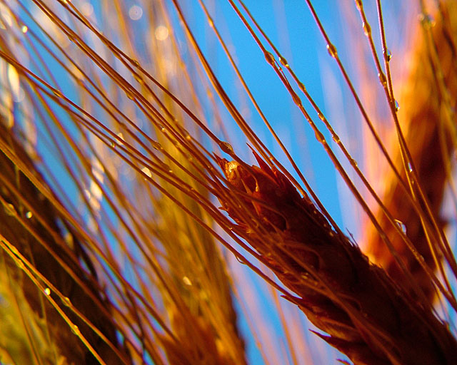
City...love it...rarely leave it...would have loved to have....got to the suburbs yesterday...ain't no country though. Best I could do under the circumstances was come up with something in the studio and this is it. Have these dried grain stalks from the florists and they last a spell, the last ones I got were this past fall. Sprayed them with water and set them up in front of my computer monitor with a light blue background on the screen. Guess a clould might have been nice, but I liked the color of grains look against the blue. Had one clamp lamp with a 100w halogen bulb in it set up behind and too the left of the grains. Shot with a 10x close up filter on the camera with the white balance set on cloudy.
Surely do not expect it to do well...NP...I already understand.
Post: Layer adjustments for levels (25% opacity), brightness contrast and hue saturation (both 75% opacity). Sharpen. Cropped twice. Resize. Sharpen.
Statistics
Place: 38 out of 219 Avg (all users): 6.1024 Avg (commenters): 8.0000 Avg (participants): 5.9400 Avg (non-participants): 6.2571 Views since voting: 1059 Views during voting: 318 Votes: 205 Comments: 12 Favorites: 0
This is a difficult image for me to critique, because there's much about it that I love, but also areas in which it fails to impress me.
Color, for example; the rendering of the grasses and the grains themselves is nothing short of exquisite, and I say this as one who deals witht hese sorts of subjects all the time. BUT, the cartoonish quality of the sky-blue is actively detracting from the compostion as a whole, almost destroying my faith in it. I'd love to see a version where hue/sat was used to mute the sky a fair amount.
Sharpness, ficus, acuity, spectacular, bokeh is lovely. BUT those danged water drops aren't pronounced enough to "sing", so they come across more as distractions than as positive elements.
The composition, in general, is strong, witht he well-expressed diagonal further emphasised by the converging, minor diagonals of the lesser elements. BUT the large, vertical, OOF grain mass on the right seems somehow clumsy amidst this grace and delicacy. Were it further back (and thus more OOF) or lighter, it would be less of an issue. Also, the sky is workign against you compositionally because the color is so startling and domiant; far more emphasis is being palced on these relatively random negative spaces than I think they warrant.
So, in summary, I see an extremely well-executed technical image that's really very appealing to look at, but I see it being limited by its minor, internal flaws so it's somewhat less than it might have been. I see it finished around 6.1, and that's about what I'd have guessed it would do. Nice shot!
I like the contrasting colors. It took my eyes a moment to realize what it was. I wonder how this would look if you pulled back just a bit, letting the viewer see more of the grain/stalk. Good natural lighting and colors though





 Add photograph to your favorites
 Add photographer to your favorites

 Photographer found comment helpful.


