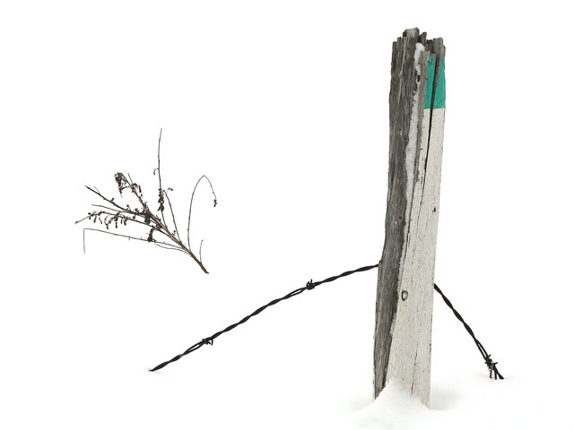
The first thing that popped in my mind the first second when this photo came up was: Blown out!
Ive been looking at your other photos in your portfolio and have seen other snow photos, and for me, the more contrast in those work better than this one.
Don’t get me wrong, I like the photo, and I understand that you probably meant it as negative space, but looking at it as a viewer it looks blown out.
I realy think that with just a bit more contrast this photo would have done btter, but well, it’s DPChallenge, and nothing is certain.
The composition is good, good use of the rule of 3rds, good use of negative space, however I think it would have been even stronger without the branch. I am a sucker for negative space…
Sharpness is good, color is good, the only thing I can say has already been said.
I hope this critique will help you “evolve” your photography and/or your DPC experience.
If the comment was helpful please select the checkbox, this gives the CC members the feeling that we do some good work.
Alot of white and knowing that there is snow there doesn't tell me it's really supposed to be negative space. A touch of contrast would have gone a long way to giving the snow some depth and would have helped out the branch floating on it's own.
i am not sure this screams country life but i really like the simple composition, it looks like a style i have appreciated the short time i have been on dpc.





 Add photograph to your favorites
 Add photographer to your favorites

 Photographer found comment helpful.


