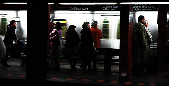
This is a shot from my first trip to NYC. I think the shot gets better the longer you look at it and I think it represents "city life" pretty well. I just hope my high saturation/contrast is well received here.
I used curves to add contrast and selective color/channel mixer/saturation to get the colors the way I liked them. I used USM to sharpen and enhance the grain, which at ISO 1400 was already there.
Statistics
Place: 42 out of 173 Avg (all users): 5.9086 Avg (commenters): 6.4615 Avg (participants): 5.7250 Avg (non-participants): 5.9571 Views since voting: 1115 Views during voting: 479 Votes: 383 Comments: 28 Favorites: 2 (view)
First impression: My eyes were drawn to the center figure with her face looking down the track. The lighting contrast and the red coat were the draw. Then up to the white lettering before the girl pushing the stroller, then over to the two gentlemen. But then I was drawn back to the center figure.
I think you met the challenge well. I liked the way you captured the blank impersonal look on the peoples faces.
I find the picture unnaturally dark. It appears as if there is a post on your side of the tracks. This creates a large black space. I think your shot would have been improved if you could have moved to your right and excluded it.
I like what you did with the colours. They create a nice contrast to the train and shadows and draws you to the peoples faces.
The granularity works for this shot.
All in all I like the picture, it brings back memories of my days riding the subway.
I am impressed with the lighting treatment here. Those high contrast highlights look really goos. I feel I want to get closer to see more detail, how did it look when you tried a tighter crop? I would suggest too that u should rotate your entries to get nice vertical verticals
Good work - the blurring of the train is done beautifully, just enough to show motion but not overdone. The almost-silohuetted people also works really good. Their faces really stand out compared to the darkened clothing. Great job!
Wow: I'm amazed that you pulled off a shot in a Subway on 34th Street (which line is it: the 1 or the 9?) without a cop's hitting you upside the head with his night-stick. Nice work.
Challenge
- Relevant to the Challenge? Yes
- Is subject unique (vs. unoriginal or rehashed)? Yes
Compostion
- Good or Bad? How can it be fixed? Needs a little height to it.
- Is there anything that should be removed? The shadow behind the woman on the on the left side is distracting.
- Good use of Depth of Field? Yes
Lighting
- Good use of light? No. It a bit too dark (yes I know subways are that way) the shadows are blocked-up, while the train is blown out.
Aesthetics/Artistic Appeal:
- What is my reaction or feelings? The image needs a little punch, but it shows people going about their daily routines -- Citylife.
Nice grainy image works for this challenge, IMO. I like the narrow, horizontal frame for this shot. Just wish it were a bit bigger (I know you probably used up your max on the width). Could wish for slightly more exposure in the foreground. I love the blurred train.
Perhaps a touch on the dark side (I have often suffered the wrath of people who don't see much detail on their monitors), but I like it a lot.
The motion blur vs the static people works very well here.





 Add photograph to your favorites
 Add photographer to your favorites

 Photographer found comment helpful.


