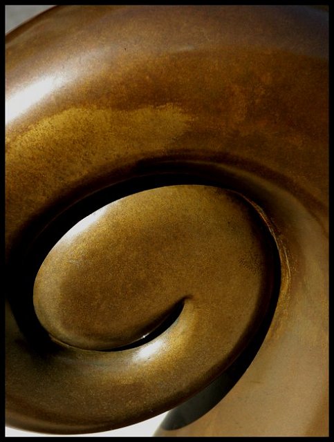
Taken in Courtney Place, Wellington. Took some shots on the 30/12 then went back and polished up the koru and took more shots. What is funny is that I did have not taken many photos and this one I thinks is just lovely.
Got some strange looks when I was sitting in the middle of the road on a traffic island - brushing down the koru and then (vegetable) oiling it to bring out the colour.
Cloned out speckles and spots altered Brightness/contrast.
Statistics
Place: 675 out of 833 Avg (all users): 5.0242 Avg (commenters): 6.2727 Avg (participants): 4.9142 Avg (non-participants): 5.5200 Views since voting: 3340 Views during voting: 526 Votes: 413 Comments: 14 Favorites: 0
The koru shape is a scroll shape and is linked to the New Zealand fern plant. The shoot of the fern has a curled-over tip which unfurls and becomes a fernleaf.
The koru reaches towards the light, striving for perfection, encouraging new positive beginnings...
The koru, represents the unfolding of new life, that everything is reborn and continues. It represents renewal and hope for the future.
I wish you would elaborate on what a koru is. I will be the first to admit that I'm a bit ignorant when it comes to New Zealand culture.
On to the picture! Best of is a bit more difficult to critique, since there is no challenge to adhere to.
There are a few things I notice. I think the fact that the background is clsoe to white on the bottom, and gray on the top is a bit distracting.
As pointed out already, there are a few hot spots where the highlights area.
I'm not terribly fond of the crop. The tighter crop on it doesn't seem to add anything to the photograph. I don't know what the whole thing looks like, or what the circumstances are for you to crop it like this, but nothing is added with it. One reason for this is the dark area on the left of the photo. It look arbitrarily cropped.
The oiling was a nice touch. It adds a nice luminosity to the picture.
I think the reason this didn't do as well as it could have is because it was a best of. If this had been submitted for an abstract challenge, it would do much better. While this a nice photo, there is nothing to catch the eye, so in voting among hundreds of photos, this could easily get lost.
Please remember, much of this critique is personal opinion, especially since it more of an abstract, and everybody has a different opinion on an abstract.
It looks like chocolate! Great shaape, great placement of the shape to create interesting composition. You are going to lose points for the harsh lighting and the glare on the highlights. What is a koru anyways? I'll come back after the challenge ends to see if there is more info about it.






 Add photograph to your favorites
 Add photographer to your favorites


 Photographer found comment helpful.


