| Author | Thread |
Comments Made During the Challenge  |
|
|
12/27/2005 09:06:04 AM |
|
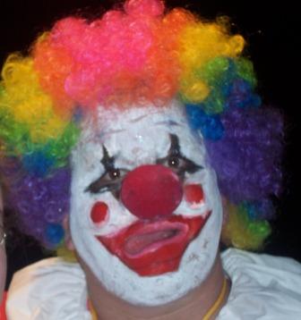
With a bit more focus and more space around his head, I would have scored this higher. |
|
|
|
12/27/2005 01:30:53 AM |
|
This image is too small. Could have been larger to show more detail. I think the contrast on this image is too low. A bump perhaps. 5 |
|
|
|
12/27/2005 01:19:46 AM |
|
he's either drunk off his arss or he's having a stroke. |
|
|
|
12/26/2005 09:26:33 PM |
|
No thought on exposure and composition. |
|
|
|
12/24/2005 03:27:16 PM |
|
I like the concept. The pic looks too much like a snap shot. |
|
|
|
12/24/2005 11:29:34 AM |
|
|
|
12/23/2005 02:01:34 AM |
|
|
|
12/22/2005 11:02:04 AM |
|
The picture is a bit out of focus |
|
|
|
12/22/2005 03:57:16 AM |
|
Seems a little out of focus, and the clown's hair is chopped off on the left. Would be more scary if there were more space around it. |
|
|
|
12/21/2005 05:46:25 PM |
|
Scary - better sharpness / focus would help. |
|
|
|
12/21/2005 09:22:50 AM |
|
|
|
12/21/2005 02:05:23 AM |
|
Using Coulrophobia- Fear of clowns - in the title might have helped. I don't get the Stephen King reference but understand what he writes. I found the picture, very small, quite blurred and centred. It is a good concept, just didn't quite work this time. |
|
Home -
Challenges -
Community -
League -
Photos -
Cameras -
Lenses -
Learn -
Help -
Terms of Use -
Privacy -
Top ^
DPChallenge, and website content and design, Copyright © 2001-2026 Challenging Technologies, LLC.
All digital photo copyrights belong to the photographers and may not be used without permission.
Current Server Time: 06/30/2026 09:55:07 PM EDT.