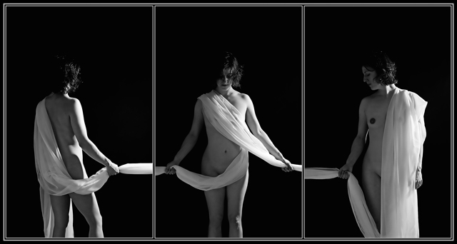
Image I wanted to submit for the triptych challenge, but due to time constraints, I didn't get the chance to shoot it. Thanks to my beautiful wife for posing for me again!
This is a great idea! I think if you fiddled with it a bit to make the fabric flow from one panel to the other seamlessly, it would make a world of difference. And if you removed the inner border, so it was just a black background with the three poses, fabric flowing into each other...wow, man, that'd be rad! But hey, as it stands, it's a great photo... I totally dig it!
Yup, definitely would have worked for me in the Challenge. I couldn't have voted on it, but I like it. I've seen something similar in one of the Pro-Lighting books, albeit a color image.
BTW, thanks for your posts in my thread. I appreciate people that stand up for others.
BTW again, your wife is very beautiful, definitely worthy of artistic impressions.
fine work. reminds me of a triptch done by Benny De Grove.
I love the neutral expressions used by your wife and all three poses, well, maybe a little more profile showing on the first panel. If you try it again maybe move your lights to follow the composition so it starts with a shadow and ends with a shadow and work on lining up the fabric. I think the problem with the alignment is her hands are to close to the edge in the center panel. If there was the same space allowed there, the sheets would line up better.
Anyway, I like it.
Wow, thanks for all the positive words. I agree with lining up the sheers across the frames. I would've loved to be able to get this one right, but alas, my model was pooping out on me! Maybe I'll convince her to try again some day!
Excellent concept! :) I like the middle and right side poses more than the left panel pose; it could use a little extra something to bump up it's interest. Maybe her looking into the center panel (as that would provide some symmetry) or position the sheet over her body like the right panel, but still have her facing away. I know it's got to be wicked tough to line up the sheet as it crosses frames, but it would help for sure. The only other tiny suggestion I have is to try to make the lighting of the sheet the same as it crosses the frame edges. Right now, because of the light source, the sheet on the right side of the frames is brighter than the sheet it is transitioning into.
With these few things fixed, this is absolutely something I'd hang on my wall. If you redo it and make it available for print, let me know :)
Would have been cool if the photo on left was looking more to the right this would have matched the one on the right. I agree it would have been hard to do but the cloth would look better if it was lined up also. All said and done, "good job". I would have given this a 7 also.
This is a brilliant idea. I'm not sure if I find the light and shadows a bit harsh but the more I study it the better it looks. I know it's probably really hard but it's a shame the fabric doesn't link together better between frames but I understand how tricky this would be. You're lucky to have your beautiful wife to pose for you as well. A big pat on the to both of you. Well done!
This is a very good idea, and the execution is not so bad either. The model does come across as a bit uneasy, IMHO. The lighting is pretty good and the use of B/W adds to the "poetic" atmosphere that I'm sure you were looking to get. If this had made the challenge, I would probably give it a 7.
I really really like this concept, but I'd rather wanted the sheets to fit eachother perfectly. But, on the other hand, that's pretty hard to do.
Great lighting and B-W!




 Add photograph to your favorites
 Add photographer to your favorites

 Photographer found comment helpful.


