| Author | Thread |
|
|
11/24/2003 06:45:26 PM |
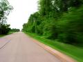
love the contrast/saturation
|
|
|
|
06/18/2002 04:27:00 PM |
|
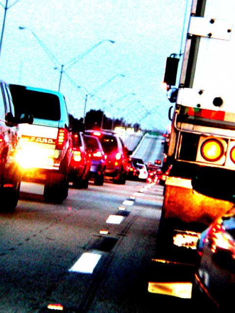
I really like this pic. The colors are glaring and the angle gives it a nice line. I can almost hear the horns... This has alot of impact and the title is great. |
|
Comments Made During the Challenge  |
|
|
06/16/2002 08:00:00 AM |
|
Creative shot. Use of off angle adds impact to this photo. I prefer sharp photos as a rule but this effect works for me with this photo with use of grain. |
|
|
|
06/15/2002 03:37:00 PM |
|
Like the post editing, My kind of photo."9" Nah stuff it "10" good job ;-) |
|
|
|
06/15/2002 02:05:00 PM |
|
How many times have I seen this view! I like the style - it makes a dull subject seem intersting (especially the truck) |
|
|
|
06/14/2002 10:57:00 PM |
|
A bit grainy, but I like the way you took the photo at this angle and pushed up the colours to make the feeling of frustration more tangible. |
|
|
|
06/14/2002 11:00:00 AM |
|
This photo keep creeping up in scoring with me, because the more I looked at it, the more i realized how well it conveys exactly what you've titled it... frustration. Well done. |
|
|
|
06/13/2002 07:23:00 PM |
|
I feel it! Your decision to tweak the colors really adds to the feeling of AUGGGH! |
|
|
|
06/13/2002 04:58:00 PM |
|
Normally, colors like this annoy me, but I think it helps to set the mood for this picture. I'm sure others have nailed you on it, though. I think it gives it a surreal effect, though. |
|
|
|
06/13/2002 01:39:00 PM |
|
I do get a feeling of frustration from this photograph :) I think the harsh coloring and whatever filters or editing that has been applied does a very nice job of conveying the feeling and frustrations of being stuck in traffic... great shot! |
|
|
|
06/13/2002 12:45:00 PM |
|
I like the tilted angle of this and the colors are cool. 9 :) |
|
|
|
06/13/2002 10:15:00 AM |
ah, you're not from the DC area, are you? ; )
the hyper saturated colors, I can't tell if they add or detract. I think they add. |
|
|
|
06/12/2002 05:52:00 PM |
|
Nice use of the grain and angle... I feel like I have my head tilted out the window to look down the line of traffic on a hot, hazy day. |
|
|
|
06/12/2002 09:17:00 AM |
|
I do like the tilt. The colors and levels are extreme...I like it, but I might like it better less extreme |
|
|
|
06/12/2002 02:55:00 AM |
|
Maybe you have an idea there -- mood cars. The color changes as the driver's rage level rises... |
|
|
|
06/11/2002 09:27:00 PM |
|
Grainy, bad focus & color |
|
|
|
06/11/2002 05:59:00 PM |
|
Nice use of camera angle and oversaturation to convey a mood. |
|
|
|
06/11/2002 03:04:00 PM |
|
Overexposure and color bleed does not make this scene look any more interesting. |
|
|
|
06/11/2002 01:09:00 PM |
|
Oh, man, do I know how that feels! I like this photo - breaking the rules works here. |
|
|
|
06/11/2002 12:38:00 PM |
|
Me too, every work day. I don't want to look at it any more even if it is artisticly over saturated. |
|
|
|
06/11/2002 11:56:00 AM |
|
While the quality of the image is somewhat poor, the composition and colors of the shot make up for it. The title is spot on, the image really does give off a feeling of frustration. |
|
|
|
06/11/2002 10:07:00 AM |
|
creativety 5 interesting 7 focus 8 framing 7 = 7 |
|
|
|
06/11/2002 01:51:00 AM |
|
Are we allowed to do this with the colors? But it's pretty cool.. I can see this being used for a traffic page for a website of a news station or something. Also it reminds me of summer.. hot.. sticking to the seats while you wait in traffic.. AUGH! :) Good pic |
|
|
|
06/10/2002 10:40:00 PM |
|
I like the way the over saturation conveys the title. |
|
|
|
06/10/2002 09:18:00 PM |
|
Too grainy and blown out for my tastes. |
|
|
|
06/10/2002 08:07:00 PM |
|
I very much like the saturation of this picture... good job. Nice framing too. |
|
|
|
06/10/2002 07:22:00 PM |
Powerful image. I like the color saturation, really eye catching, but maybe over the top. Digital editing has a price, it's almost always image quality (pixelation). Was the original photo as grainy as this? I doubt it. Look at the lamp posts, in places they disappear, not good.
Photo 5 Creativity 10 Road 8 total 8 |
|
|
|
06/10/2002 05:32:00 PM |
|
Bridges! They open too often don't they? LOL Fun shot, great title. |
|
|
|
06/10/2002 12:19:00 PM |
|
like the tilt, and the colouring |
|
|
|
06/10/2002 09:20:00 AM |
|
Good overexposure! Usually a bad thing but it fits the idea there. |
|
Home -
Challenges -
Community -
League -
Photos -
Cameras -
Lenses -
Learn -
Help -
Terms of Use -
Privacy -
Top ^
DPChallenge, and website content and design, Copyright © 2001-2026 Challenging Technologies, LLC.
All digital photo copyrights belong to the photographers and may not be used without permission.
Current Server Time: 06/27/2026 08:32:40 PM EDT.