| Author | Thread |
|
|
09/22/2005 03:14:09 PM |
Greetings from the Critique Club!
I didn't get a chance to vote on this photo, but am pleased to give you my thoughts now.
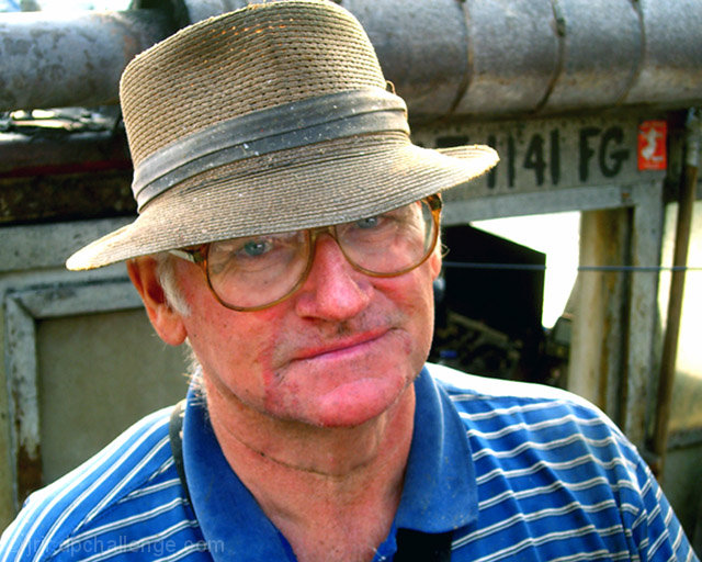
Colour, Composition and Contrast
Let me dive right in with composition. This is generally a landscape (though nearly square) portrait, which is unusual for a portrait but can be a very effective way to present an image and give it impact. I think its most effective when you use all elements of the image, ie. background, forground (if applicable) and the subject to work together in the composition. Putting your subject on a 3rd line is one example, and using your focal distance to create some blur (or "bokeh") in the background is also effective. Also, if you are going to choose landscape, i would use a larger ratio, meaning, make it longer than it is high by a lot more than you have now. If you were going for square, go for perfect square. It looks more deliberate and that helps an image.
As for the colour and contrast, I think that the colours are less compelling than the features of your subject and I would have desaturated the image to really convey that feeling of a weathered lone fisherman. The redness of his skin draws too much attention and makes it look like a less polished shot without a clear message. I think using one of the many methods to desaturate, including the channel mixer method (my favourite because of the level of control) you can really make this image something special.
Another composition option that might give the shot more precise viewer "focus" would have been to crop closer to your subject and cut out distracting background details like that bright white spot to the left of the subject (our right). Keep in mind that if you are shooting someone and its NOT a candid, you can ask them to move to a different place with a better background.
Focus and Lighting
The face is a bit out of focus and that really distracts from the image. Your subject is this man and his face and so you should ensure you have captured the most detail with a better focus than is present.
My only comment with respect to lighting is that i wish the lighting differed on the bg as on the subject. This was probably not possible with this shot as it is outdoors and I doubt you had a studio lighting kit in your back pocket!
Overall
Overall, this is an image that appears to be struggling to find its voice. A few processing changes could really assist, but you are still left with poor focus on the face of the subject and that makes it difficult to improve THIS image more. A good effort though! Good luck in future challenges. |
|
 Photographer found comment helpful. Photographer found comment helpful. |
Comments Made During the Challenge  |
|
|
09/16/2005 03:02:53 PM |
|
I understand that this guy was probably just about as red and raw looking as he appears in this photo... but it would have been more flattering to him (without detracting from its effectiveness as a portrait) if you'd desaturated the reds a bit. He'd still look chafed and weathered without looking quite so burnt. |
|
| Photographer found comment helpful. |
|
|
09/15/2005 06:10:34 PM |
|
His skin is really pink on my monitor - pinker than sunburn. |
|
| Photographer found comment helpful. |
|
|
09/15/2005 03:59:18 PM |
|
Really like the original feel of this shot. It hasn't been sterilized in a photo improvement program. Good job! and i like the expression on his face. |
|
| Photographer found comment helpful. |
|
|
09/14/2005 05:33:39 AM |
|
Appears a little oversaturated - did you up the contrast or saturation? |
|
| Photographer found comment helpful. |
|
|
09/14/2005 12:48:15 AM |
|
Nice shot, the title explains a lot. Good lighting. |
|
| Photographer found comment helpful. |
|
|
09/12/2005 10:48:01 PM |
|
Very nice Picture! Love the tired eyes look. Only thing I see to improve is to crop out that red square on the right. Good Job! |
|
| Photographer found comment helpful. |
|
|
09/12/2005 08:27:21 PM |
|
It could be my monitor, but his skin tones are so very, very red. I like the eyes and the naturalness of your subject as opposed to other "professional looking" models used for this challenge. |
|
| Photographer found comment helpful. |
|
|
09/12/2005 03:23:46 PM |
|
I do not like the background and it seems to be in better focus than his face (which seems to be too red). The water, sky or dock would have been better. |
|
| Photographer found comment helpful. |
|
|
09/12/2005 02:54:10 PM |
|
Too much red in the face. I do like the pose/hat and lighting. Your subject looks like he has been working hard this day. |
|
| Photographer found comment helpful. |
|
|
09/12/2005 01:05:53 AM |
|
Is it me or is this Robin Williams? |
|
| Photographer found comment helpful. |
|
|
09/12/2005 12:42:52 AM |
|
Color clash. The colors all work against each other, and there is no shadows or deep light to cast your attention away from it. |
|
| Photographer found comment helpful. |
Home -
Challenges -
Community -
League -
Photos -
Cameras -
Lenses -
Learn -
Help -
Terms of Use -
Privacy -
Top ^
DPChallenge, and website content and design, Copyright © 2001-2026 Challenging Technologies, LLC.
All digital photo copyrights belong to the photographers and may not be used without permission.
Current Server Time: 06/29/2026 01:50:16 AM EDT.