| Author | Thread |
|
|
09/12/2005 01:04:31 PM |
|
 Photographer found comment helpful. Photographer found comment helpful. |
|
|
09/12/2005 12:35:21 AM |
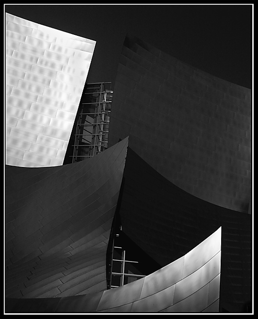
Originally posted by Imagineer:
Masteful toning and an intriguing viewpoint make this a visual Guinness for me!
: )
Only one small criticism which is that there seems to be some strong NeatImage or noise redcution applied, which has removed some of the realism. |
Thanks for the nice comment Imagineer. Coming from you, that's like Eric Clapton telling a kid in a garage band "great music." :-) And thanks to all for the nice comments.
Nope, no Neatimage or noise reduction in this one (it does look like it though). The building is made of stainless steel plates, and is really smooth all over.
Message edited by author 2005-09-12 00:56:05. |
|
Comments Made During the Challenge  |
|
|
09/11/2005 07:55:21 PM |
Masteful toning and an intriguing viewpoint make this a visual Guinness for me!
: )
Only one small criticism which is that there seems to be some strong NeatImage or noise redcution applied, which has removed some of the realism.
|
|
| Photographer found comment helpful. |
|
|
09/11/2005 09:46:58 AM |
|
| Photographer found comment helpful. |
|
|
09/11/2005 01:28:35 AM |
|
Nice. Not enough M's but plenty of contrast. 7 |
|
| Photographer found comment helpful. |
|
|
09/10/2005 01:37:36 AM |
|
Interesting angle, nice lighting. |
|
| Photographer found comment helpful. |
|
|
09/09/2005 07:54:33 PM |
|
Perfect lighting and a great image for this challenge. One of my favorites. |
|
| Photographer found comment helpful. |
|
|
09/08/2005 04:03:05 PM |
|
Althought this is very dark, it does work because most of the detail is still visible. Great capture. |
|
| Photographer found comment helpful. |
|
|
09/08/2005 03:46:52 PM |
|
Reminds me of the Guggenheim museum in Madrid. |
|
| Photographer found comment helpful. |
|
|
09/08/2005 08:10:30 AM |
|
this is amazing, nice one, desny concert hall good one, you should show it to Frank O. Ghery :p, but really its one of the best |
|
| Photographer found comment helpful. |
|
|
09/07/2005 08:12:02 PM |
|
What great lines and composition! Really beautiful job here. My only suggestion would be to perhaps make the black border more of a dark silver to match some of the tones in the image. Otherwise, great job! |
|
| Photographer found comment helpful. |
|
|
09/07/2005 06:31:13 PM |
|
not enough depth of tone in the middle but nice idea... :) |
|
| Photographer found comment helpful. |
|
|
09/05/2005 09:22:30 PM |
|
I'm digging the chaotic feel to this image, great use of available light! Nice contrast and interesting subject matter! :-D |
|
| Photographer found comment helpful. |
|
|
09/05/2005 08:56:52 PM |
|
Good contrast, but I'm having trouble focusing on anything. I think it's just not very interesting to ME. But I cna tell alot of effort went into it, so I vote 7. |
|
| Photographer found comment helpful. |
|
|
09/05/2005 07:27:40 PM |
|
I'm not sure what the shapes are, but I like them. For me though, the two dark gray ones detract from the high contrast and I find the metal behind these shapes distracting. I do like the composition and the white border is a nice touch. |
|
| Photographer found comment helpful. |
|
|
09/05/2005 05:37:56 PM |
|
Looks like a Gehry building. I like the composition, could probably benefit from a little bit more daylight reflection, perhaps at a differenttime of day. |
|
| Photographer found comment helpful. |
|
|
09/05/2005 01:53:39 PM |
|
| Photographer found comment helpful. |
|
|
09/05/2005 11:57:18 AM |
|
| Photographer found comment helpful. |
|
|
09/05/2005 10:55:06 AM |
very nice perspective and subject... 7
|
|
| Photographer found comment helpful. |
|
|
09/05/2005 09:42:26 AM |
|
| Photographer found comment helpful. |
|
|
09/05/2005 09:33:52 AM |
|
split white areas, make the eye move to much. What do ya want me to focus on? |
|
| Photographer found comment helpful. |
Home -
Challenges -
Community -
League -
Photos -
Cameras -
Lenses -
Learn -
Help -
Terms of Use -
Privacy -
Top ^
DPChallenge, and website content and design, Copyright © 2001-2026 Challenging Technologies, LLC.
All digital photo copyrights belong to the photographers and may not be used without permission.
Current Server Time: 06/29/2026 04:07:18 PM EDT.