Well...there are a lot of ways to look at high-contrast--I'm guessing this is more the DPC way than the landscape I had entered. Guess I'll just have to put that one up as a print.
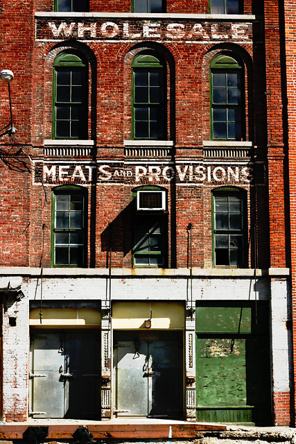
I love scrounging around the ruddier sides of the town--this was taken of a building undergoing renovations. The pigeons still hold the majority of RealEstate--but not for long.
Processing--first time I've tried making layers with multiply and vivid light (80% +/- on both). Flatten, crop, resize-then bump the heck out of the Master Hue/Sat so my lovely colors aren't compressed away on the upload, sharpen (75%, .5, 3)
(aug_end/BgCard_01_168)
Statistics
Place: 163 out of 343 Avg (all users): 5.4746 Avg (commenters): 6.0000 Avg (participants): 5.2973 Avg (non-participants): 5.7727 Views since voting: 745 Views during voting: 320 Votes: 236 Comments: 12 Favorites: 0
Well textured, rustic subject yields a good opportunity for contrast in the traditional sense. The slight barrel distortion (tapering towards top) is distracting in such a squared viewpoint though and could have been adjusted. While the subject is good and the lighting is strong, I would have liked to see just one extra element of intrigue to set it off, such as a person or animal in the foreground - like someone walking a dog with a shopping bag.
I like the linear architecture of this shot. The lighting is nice. The green is a good contrast to the red brick but maybe not high contrast. Good luck!! 7
I love this shot. Too bad you couldn't have taken it at a different time of day to rid it of those shadows then reworked it using some cool effect filters into a black and white or sepia. Where is this?
Not crazy about the tones or composition here, but it is a technically well executed shot. You've got nice deep shadows and the highlights aren't blown out.
Love the photo, dig warehouse buildings - I do think this could benefit from some editing. At first glance, this appears slightly tilted to the right. In addition, it could use some crop...either while taking the photo, or post-editing. For example, consider the light on the lower left hand at top...it's just sort of sitting there without a purpose. Do you include more around it, to use it in the composition, or do you completely crop it out? Likewise with the shadow of the door that bleeds off the lower-left hand side.
there's alot to like in this shot. the high contrast definitely helps add to the mood. you're going to hear that you should have slightly rotated ccw and adjusted the skew at the top so that shadow line on the right was more parallel.





 Add photograph to your favorites
 Add photographer to your favorites


 Photographer found comment helpful.


