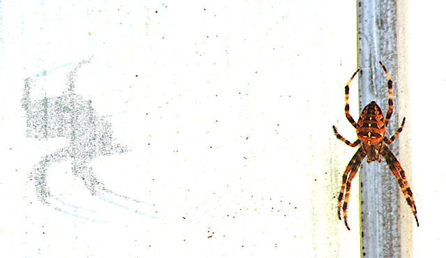
shot next to my garage door with sunlight coming in from the right (image's).
crop
brightness/contrast
curves
brightness/contrast
magic wand-area to left of spider
brightness/contrast- area to left of spider
desaturate- area to left of spider
image size
USM
The shadow on the left looks like an evil face looking back at the spider.
Statistics
Place: 236 out of 343 Avg (all users): 5.1339 Avg (commenters): 5.7500 Avg (participants): 4.9195 Avg (non-participants): 5.4889 Views since voting: 676 Views during voting: 376 Votes: 239 Comments: 10 Favorites: 1 (view)
I think this was one of the cooler shots in the challenge (and it met the challenge topic well IMHO).
Composition:
Good. Nice offset balance of the spider and shadow. The specks are a little distracting, but I think add to the roughness and contrast of the shot.
Lighting:
A tad bright, but not blown out. Very contrasty. As I said earlier, I would like to have seen a little more darkness to the shadow.
Focus:
While good, it's not tack sharp and I think that if it had been, the score would have been higher.
Color:
Like the rich colors of the spider. A little more color in other areas of the shot might have helped a tad, but I like the starkness too.
Overall:
I think a very strong entry. Very cool capture. Thanks for sharing how you did it too! :-)
i really like this. pushes way over the border of digital art, but that works for me. the balance is great and the shadow not being symmetrical really keeps the shot interesting. and the speckles in the center really help hold everything together.
All right - now this is pretty wicked! VERY cool. Interested to read how you accomplished this. Personally, I think I would have preferred more darkness to the shadows, but still a very cool shot.





 Add photograph to your favorites
 Add photographer to your favorites


 Photographer found comment helpful.

