*Critique Club*
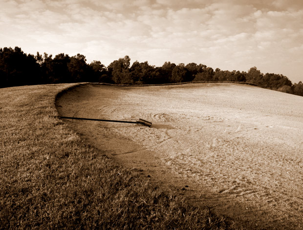
While there is a spot to the center left that has both black and whites, the majority of the photo is similar in tones. I think that the main are of the photo is not quite high contrasty enough for the challenge. Really the only are of black is the left side of the tree line.
I think it's still a nice image. I like how it's seperated by the curve of the sand area. Textures are nice, although it seems to me that maybe focus is a tad soft, since there should be even more texture in the grass, however, it seems in spots to just be blending together.
Lighting seems to have been good for the shot, no horrid bright spots or distracting shadows.
Overall, not a whole lot to look at in the image, but somehow seems to still be interesting enough to look at.
~Heather~ |






 Add photograph to your favorites
 Add photographer to your favorites

 Photographer found comment helpful.


