| Author | Thread |
|
|
09/11/2005 09:31:11 AM |
*Critique Club*
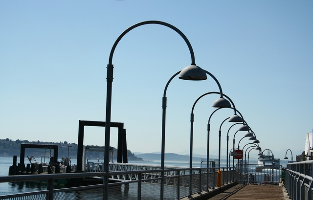
I really like your angle on the lights. I think that it is great. I would have liked to see "more" of the dock and I wish that the barge in the water wasn't there. But I guess that it would be hard to take a picure of a dock with no boats, huh? Overall, I think that it is a nice picture, maybe some cropping would improve it, but you have a good eye for interesting angles. There are a few harsh shadows, but maybe that was your intent. I can also see that this shot would be very neat at night with the lights on. I hope this helped you, good luck in future challenges, by the way...you hit the theme perfectly!!
Mandy |
|
 Photographer found comment helpful. Photographer found comment helpful. |
Comments Made During the Challenge  |
|
|
09/04/2005 06:56:36 PM |
Looks lik it could use a CCW rotation. Grant it you might have rotated CW to have the poles straight, but the horizon is off. Might have a good idea to use some distortion correction if you had it. Like the perspective and the great receding line of the lights.
Message edited by author 2005-09-05 10:26:24. |
|
|
|
09/04/2005 06:27:06 AM |
|
Well it's nice. It would have been better if you had straightened out the horizon. |
|
| Photographer found comment helpful. |
|
|
09/03/2005 11:36:22 PM |
|
I like the leading lines of the lamps. This image would be stronger if there was something at the end of the trail of lamps. I find the uneven horizon distracting. |
|
| Photographer found comment helpful. |
|
|
09/03/2005 04:44:44 PM |
|
nice pattern repetition. the horizon is crooked though |
|
| Photographer found comment helpful. |
|
|
09/03/2005 07:21:29 AM |
|
This would've made a good leading lines entry. Color feels a little off. |
|
| Photographer found comment helpful. |
|
|
09/02/2005 03:54:02 PM |
|
| Photographer found comment helpful. |
|
|
09/01/2005 06:49:34 AM |
|
The horizon needs straightening, which would straighten the lamp-posts. I would also crop everything to the left of the leftmost lamp-post. |
|
| Photographer found comment helpful. |
|
|
08/31/2005 06:03:58 PM |
|
could do without the tilted horizon but otherwise a fine entry |
|
| Photographer found comment helpful. |
|
|
08/31/2005 10:20:35 AM |
|
could be a nice photo. follow your rules of 3rds, and watch your horizon line. |
|
| Photographer found comment helpful. |
|
|
08/30/2005 09:06:36 PM |
When the horizon's at such a shallow angle off the norm, it should really be leveled out - it wouldn't detract from the half hooped lights at all (which would also benefit from having their verticals straight up). If you'd caught the ferry a few seconds later with the row of lights pointing directly at it without obscuring it, you would have been onto a perfect 10!.
I do like the intersection of one light with the next. |
|
| Photographer found comment helpful. |
|
|
08/30/2005 12:08:18 AM |
|
| Photographer found comment helpful. |
|
|
08/30/2005 12:07:58 AM |
|
Cool idea. I think this photo would have more visual impact if you had gone into Photoshop, selected the entire image, selected "Free Transform", then right-clicked and selected "Distort". Then you could have pulled on moved around the corner handles until you had all the verticals (lamp posts, etc.) aligned absolutely veritcal. Also, you always want the horizon completely horizontal when water is involved. I probably would have played with the sky a little to make it slightly darker and bluer at the top and gradually reach its natural color/tone near the horizon. Just a couple of ideas for what its worth. |
|
| Photographer found comment helpful. |
|
|
08/29/2005 08:58:48 PM |
|
good composition, I like these kind of opportunities to shoot. Looks like it might need to be rotated 1 or 2 degrees to the left maybe. The sky blends into the shot so well the colors all run together. Tough conditions to shoot in!. A cool sunset or rise, clouds, night shot would be great if all the lights light up.......5 |
|
| Photographer found comment helpful. |
|
|
08/29/2005 06:42:33 PM |
|
Nicely done, where is this? |
|
| Photographer found comment helpful. |
|
|
08/29/2005 02:00:23 PM |
|
I like the photo, but the tilted horizon has me falling out of the picture. |
|
| Photographer found comment helpful. |
|
|
08/29/2005 12:34:09 PM |
|
| Photographer found comment helpful. |
|
|
08/29/2005 12:18:26 AM |
|
Great idea for the challenge. Well executed and presented. I would like it better if the horizon were level. |
|
| Photographer found comment helpful. |
|
|
08/29/2005 12:04:02 AM |
|
I like the subject idea here but the photo feels very off balance, like everything is falling to the right side of the photograph. This could be lessened by straightening out the horizon, or perhaps even by showing more deck. |
|
| Photographer found comment helpful. |
Home -
Challenges -
Community -
League -
Photos -
Cameras -
Lenses -
Learn -
Help -
Terms of Use -
Privacy -
Top ^
DPChallenge, and website content and design, Copyright © 2001-2026 Challenging Technologies, LLC.
All digital photo copyrights belong to the photographers and may not be used without permission.
Current Server Time: 06/28/2026 03:54:09 PM EDT.