| Author | Thread |
Comments Made During the Challenge  |
|
|
06/08/2002 06:53:00 PM |
|
|
|
06/08/2002 03:14:00 PM |
|
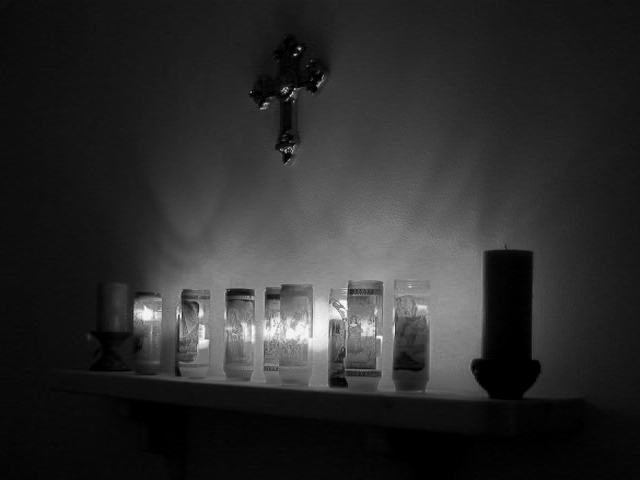
Need to work on your composure/composition with a different angle. |
|
|
|
06/07/2002 08:27:00 PM |
|
|
|
06/06/2002 01:16:00 AM |
|
Lovely lighting effect from the candles. I think more could have been made of it thought with a closer shot or a different angle. |
|
|
|
06/05/2002 03:02:00 PM |
|
I really like the overall effect of this photograph. Glad you didn't make the shelf go straight accross the shot. The cross over the center might have been better in another location. |
|
|
|
06/04/2002 10:41:00 PM |
|
concept is good, wish the candles were closer, maybe more of them so they would cast a better glow onto the cross. good job. |
|
|
|
06/04/2002 07:47:00 PM |
|
|
|
06/04/2002 03:40:00 AM |
|
This would probably work better as a vertical composition. The black areas at L and R don't really do much for me. The interest is in the candles (did you get any closeups?), the great play of light on the wall, and the cross. Needs some CCW rotation as is, and seems a bit soft. |
|
|
|
06/03/2002 09:11:00 PM |
|
I'll bet the room smelled good... |
|
|
|
06/03/2002 08:05:00 PM |
|
The cross should be just a little more visible, IMHO. |
|
|
|
06/03/2002 04:57:00 PM |
|
|
|
06/03/2002 11:28:00 AM |
Neat shot here, why aren't the outer two candles lit?
|
|
|
|
06/03/2002 06:34:00 AM |
|
This is an interesting photo but I think the framing needs a little help... There is too much dark void area on the left and the angle across the bottom doesn't work well for me... maybe a straighg on view would be better? |
|
|
|
06/03/2002 05:55:00 AM |
|
Extreamely creative. The background effect looks like smoke. I love it. |
|
|
|
06/03/2002 05:42:00 AM |
|
Tricky one to get right - just a bit too darkl to really get the mood. |
|
Home -
Challenges -
Community -
League -
Photos -
Cameras -
Lenses -
Learn -
Help -
Terms of Use -
Privacy -
Top ^
DPChallenge, and website content and design, Copyright © 2001-2026 Challenging Technologies, LLC.
All digital photo copyrights belong to the photographers and may not be used without permission.
Current Server Time: 06/29/2026 12:39:13 AM EDT.